This text was written during the temporary Graphic Design Museum Gent, installed in the DiNG vitrine. During two months, Bingo investigated the archives of the Design Museum Gent. Different archive documents were shown in the vitrine, while we researched more about the context within they were created and their makers. The following text was part of the booklet published at the end of the installation.
Frida (Craet) Burssens (1930-2020) was a decorator and designer from Ghent. She studied applied arts at the Royal Academy of Fine Arts in Ghent, where she later regularly participated as a jury member. She also studied art history at Ghent University.
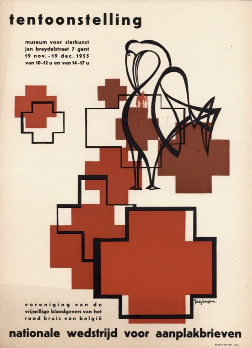
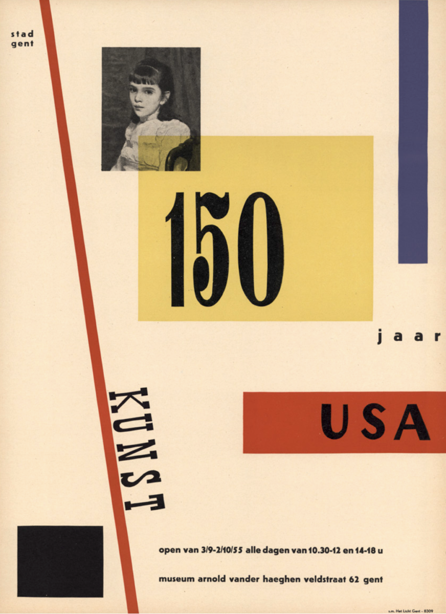
Her posters, for various exhibitions like one for the National Competition of Billposters or for the 150 Years of American Art, are a wonderful take on graphic design in the sixties. Her eye for form, her use of primary and warm colours, and also strong typographical compositions make her work very recognisable and cheerful. This series of posters also creates the first traces of the creation of a cohesive and strong graphic identity of Design Museum Gent.
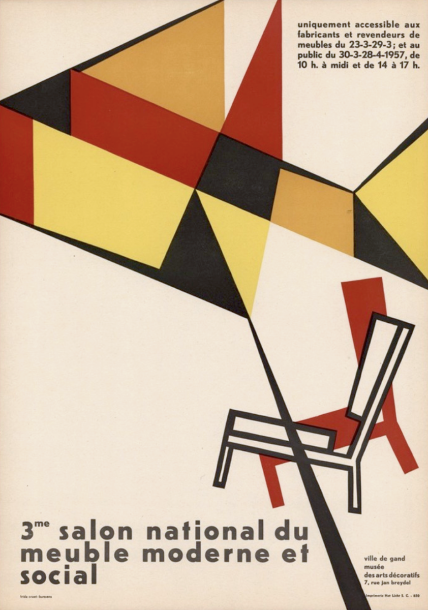
Frida Burssens is part of an exciting part of the history of Design Museum Gent. Together with the director Adelbert Van de Walle and her husband and architect Daniël Craet, Frida Burssens organised exhibitions related to the promotion of Belgian social and modern furniture. They initiated the National Salon of Modern and Social Furniture, for which Frida Burssens designed the posters and did the exhibition design.
Eight posters were discovered in the archives, each personally signed by Frida Burssens. These posters exhibit a distinctive style characterised by the consistent use of black sans-serif typography, accompanied by freely shaped illustrations. The integration of coloured abstract forms merging into a concrete object, such as a pen, cabinet, or chair, adds depth to her designs. Particularly captivating is her approach to the title, which she fully integrates into her composition. This allows her to play more freely with the words. They then become part of her artistic tools to create a cohesive and graphical image for the poster.
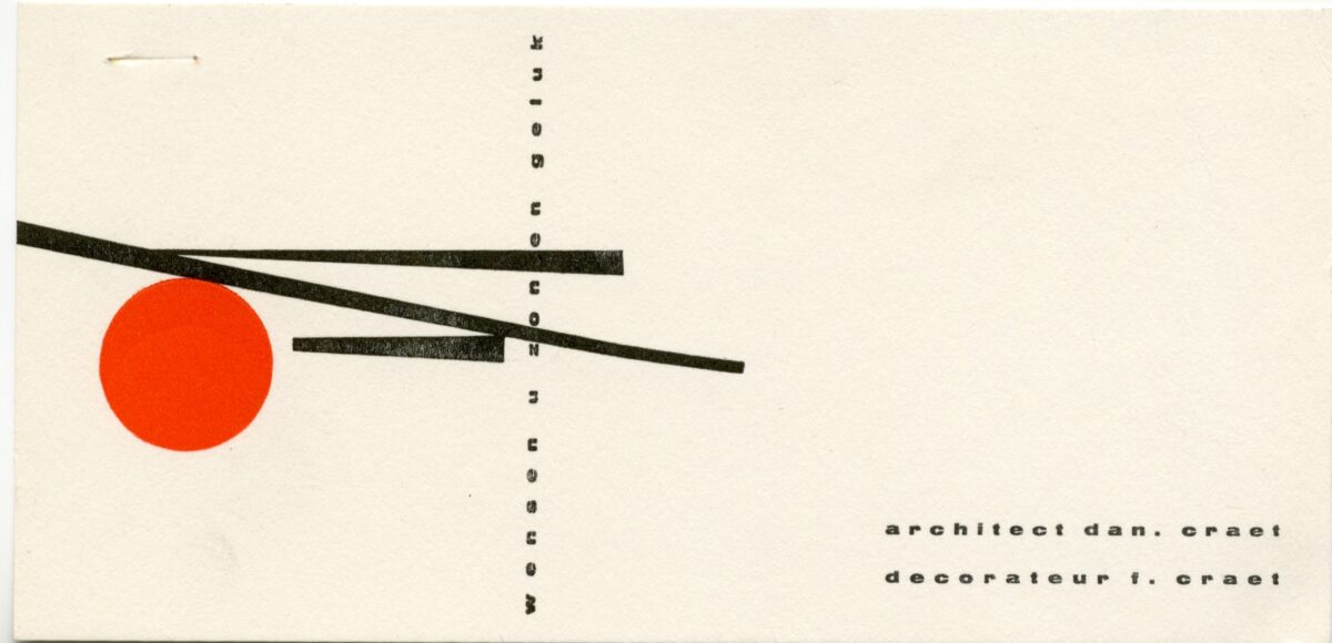

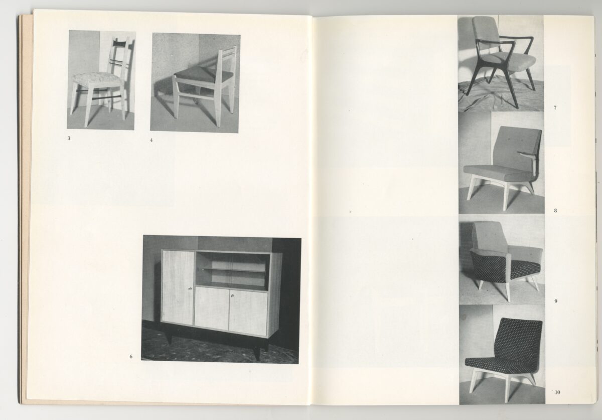
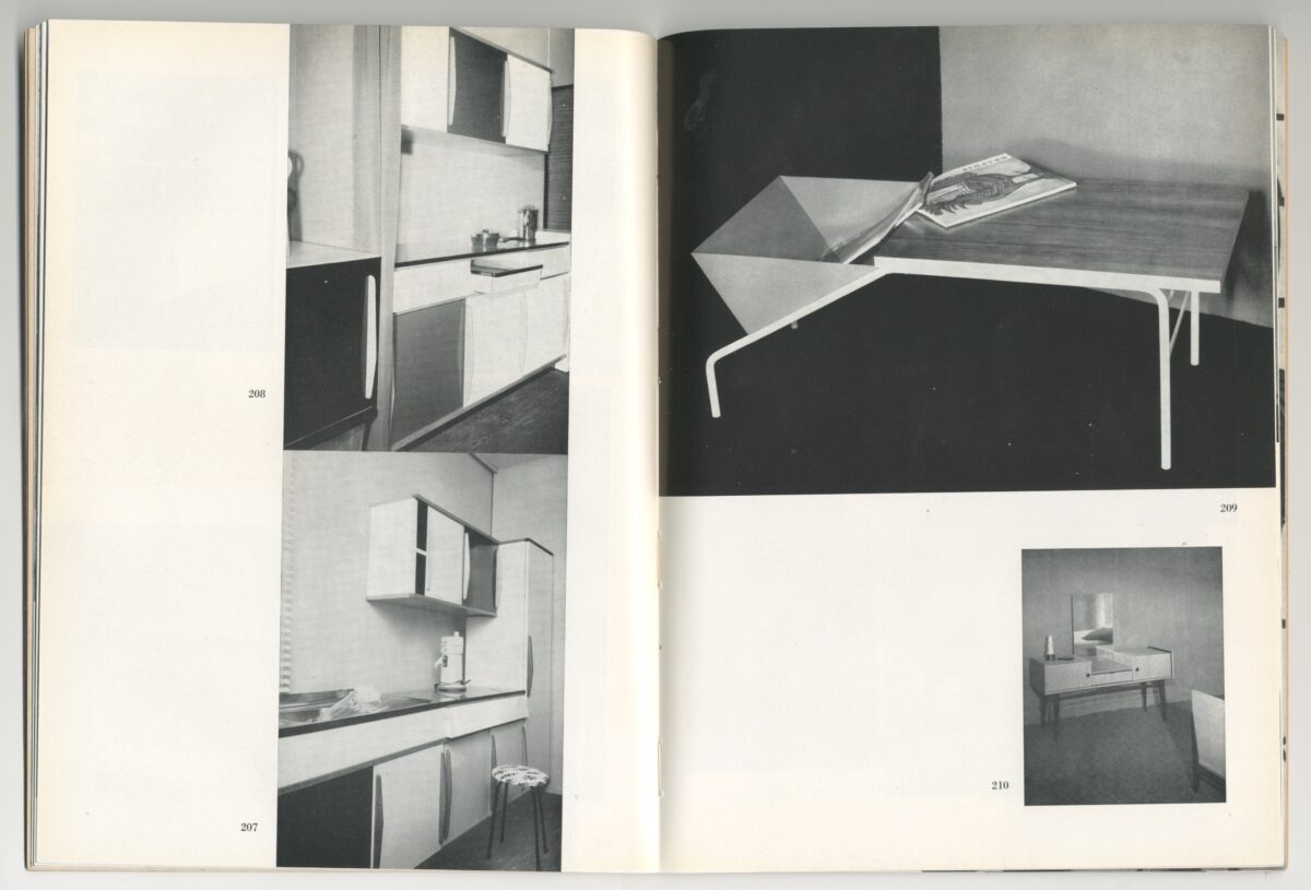
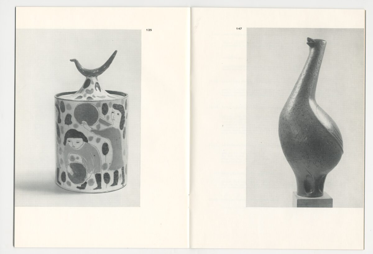
A wonderful discovery were the exhibition catalogues from this period which are beautiful pieces of ephemera. Sadly, the designer is not mentioned. The name of Frida Burssens appears as ‘decorator’. The use of different papers and the clever composition of images are proof of a skilled and attentive eye. We can also notice the use of only lowercase letters, reminiscent of Willem Sandberg’s designs for the Stedelijk Museum, distributed around the same time period.