This text was written during the temporary Graphic Design Museum Gent, installed in the DiNG vitrine. During two months, Bingo investigated the archives of the Design Museum Gent. Different archive documents were shown in the vitrine, while we researched more about the context within they were created and their makers. The following text was part of the booklet published at the end of the installation.
Hélène Van Coppenolle (1905-1985) was active in Belgium as an illustrator, graphic designer and teacher. She participated in several exhibitions in Antwerp, Ghent and Brussels, presenting her graphic and illustrative works. Hélène often designed the leaflets and posters for the exhibitions she participated in.
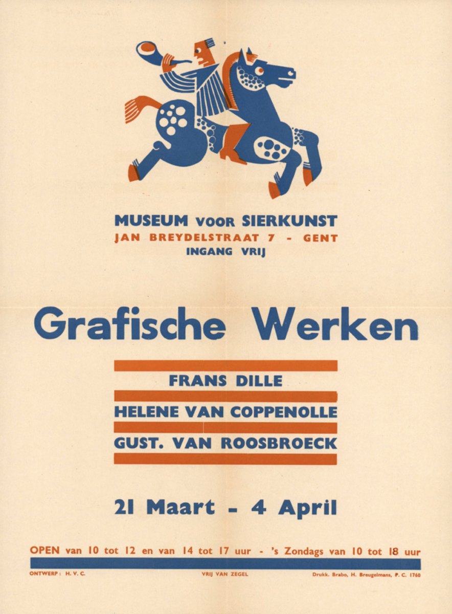
In the archives of Design Museum Gent, we found a poster from 1943 designed by Hélène Van Coppenolle for an exhibition taking place in the former Museum voor Sierkunst. The exhibition presented her own graphic works alongside Frans Dille and Gustaaf Van Roosbroeck. The poster was printed with a smart use of two colours, red and blue. At the top of the poster, a person on a horse with a horn announces the upcoming exhibition. The text is well balanced and hierarchy is created between the different information by the use of different font sizes and coloured line blocks.
Hélène Van Coppenolle studied at the Vakschool voor Kunstambachten in Antwerp and at La Cambre in Brussels, specialising in book illustration, advertising and etching. A poster by Simone Lutgen, who studied in the same school as her in Antwerp, advertises an exhibition in which Hélène participated. The two posters look alike in their similar use of typography and colour.
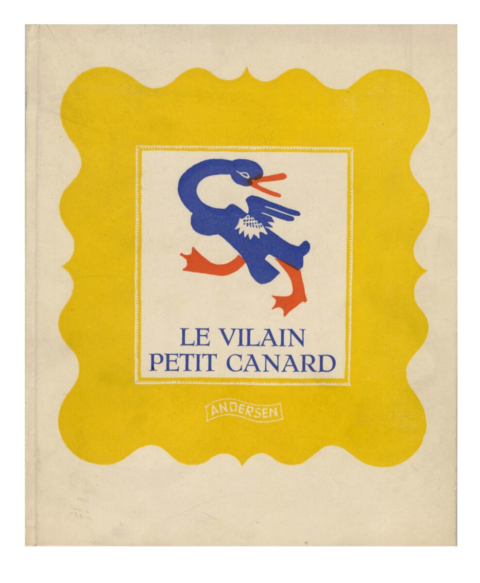
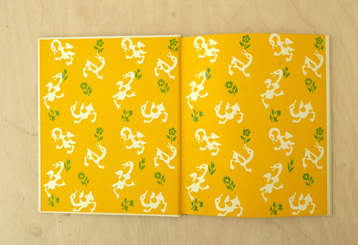
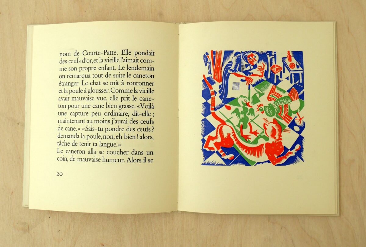
A good example of her illustrative work is the book Le Vilain Petit Canard which was published in 1942 by Le Roi des canetons and printed on the presses of La Cambre. This children’s book is richly illustrated. The book is printed in bright colours, using colour combinations of orange, blue, yellow and green. The intertwining of different colours creates a joyful overall image that accompanies the text throughout the book.
The first letter of the paragraphs is ornamented with a similar illustrative style, inviting the reader into the book. The text is set in a large and inviting font, with large margins that turn the text form into a square format. In another book, Colette Le Renard, her figures are very recognisable, filling the page with a cheerful tone.
A wonderful document that is kept at Letterenhuis is a photomontage made by Hélène Van Coppenolle. The composition is made from cut-out pictures of women. They are gathered around a table which is sketched out by a marker. Different handwritings give the names of the women. In what context this drawing was made is unknown, but we can guess this was a close group of friends or colleagues.
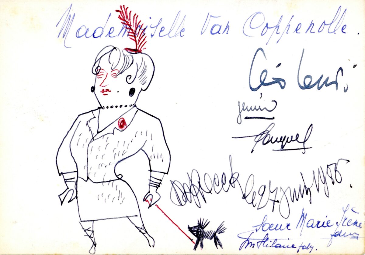
Hélène Van Coppenolle was a good friend of Lucien De Roeck, who drew her multiple times at juries or other occasions. Every drawing shows us another perception of Hélène and demonstrates their close relationship. De Roeck even drew a caricature of Van Coppenolle in which she was dressed in a women’s suit with several accessories such as a mini hat with a long upraising feather in her hair. The correspondence from Lucien to Hélène shows the creative atmosphere they were surrounded by.
The poster she designed for the 5de Biennale voor Beeldhouwkunst in 1959 is intriguing because it shows another aspect of her practice. The poster has a larger format than her other work and is printed using a different technique than the one we are familiar with from her work. Made from the combination of a photograph and typography, the poster presents a large ‘5 B’ on a red transparent background and an A on a similar green background in a stencil letter. A black arrow points from the word Middelheim to the ‘A’ of Antwerp as a reminder that the two places are close to each other. The image is very textured and could be a close-up of a material, reminiscent of a sculpture in the making.
The impressive wall graffito can show the versatility of her work she realised at the House of the Province Antwerp in 1958, representing the fusion of craftsmanship with architecture.
A lot is still to discover about Hélène Van Coppenolle, as we feel there are still many puzzle pieces missing to get a correct overview of her career. Through these few works, her practice took multiple forms, ranging from illustration to poster design to educational projects. Yet this first insight in her work fascinates by her wonderful use of colour and a joyful personal style with recognisable figures.