What lies behind the graphic identity of Design Fest Gent?
PONTON magazine is a new magazine started in 2022 and published by Z33. For its first issue in the context of Design Fest Gent, we interviewed graphic designer Ruben Vandennieuwenborg from DIFT. He was the main designer behind the identity created for Design Fest Gent.
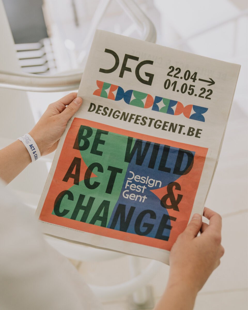
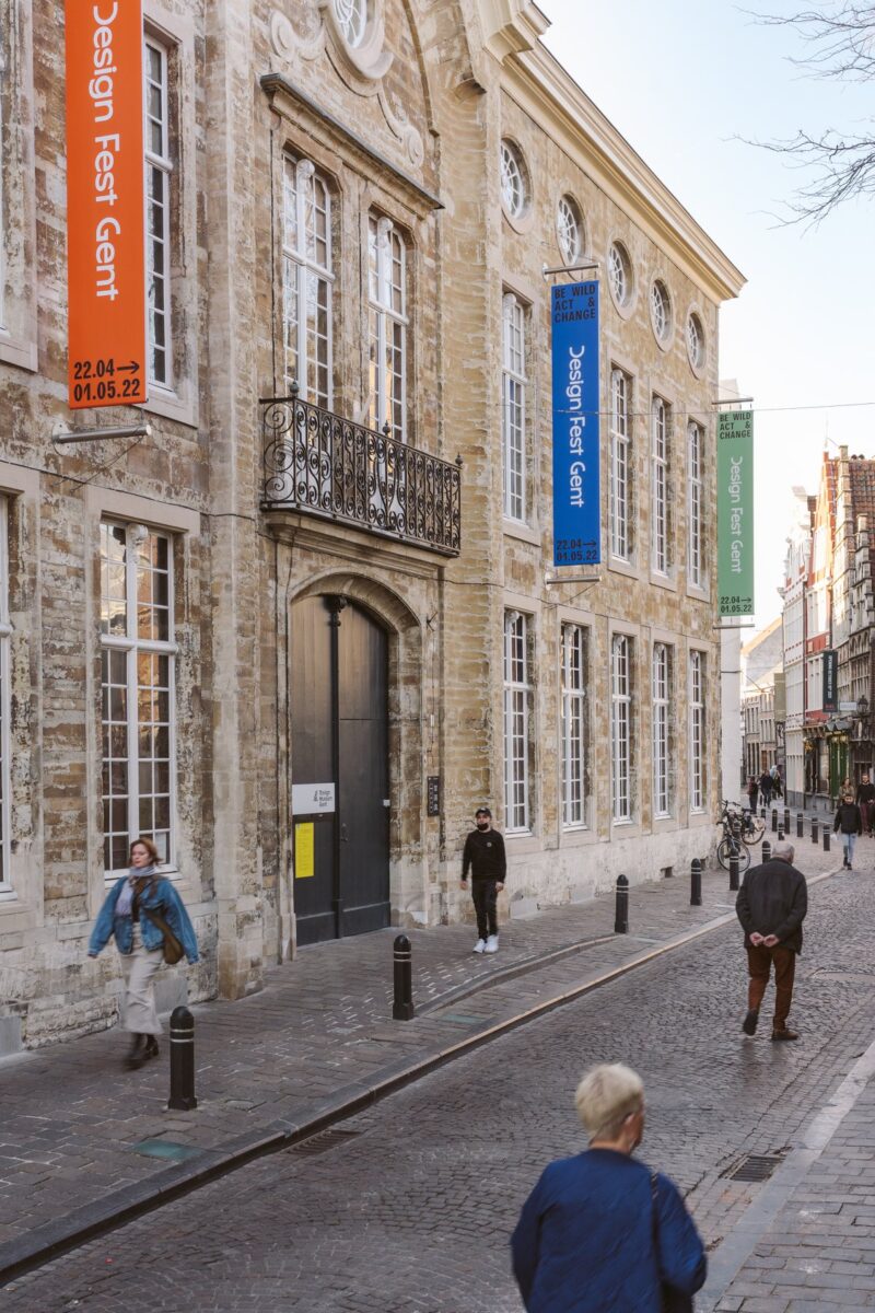
The first edition of Design Fest Gent has kicked off, creating a space for designers to present groundbreaking ideas. We wanted to take a moment to delve into the graphic identity that has been developed for this design celebration. You can’t miss it when walking through the streets of Ghent; it stands out with its vibrant colors, hourglass shapes, and the tagline “Be Wild, Act and Change.” For this, we spoke with graphic designer Ruben Vandennieuwenborg, who was co-responsible and works for the communication agency Dift Agency.
The identity of Design Festival Gent was created by the creative agency DIFT, where you work as a graphic designer. Can you tell us how the identity was developed?
RV: At DIFT, we always start with a strategy. First, we organize a workshop where we dive deeper into understanding the client, what they’re doing, and why. We then determine the project’s positioning and objectives before diving into the design. It’s truly based on a strategic approach. Alongside that, we create a mood board with images that capture not only the strategic aspects but also the desired feelings and atmosphere. These are often not graphic examples, but rather artworks and anything relevant. Next, we actually develop three possible logos. There are three designers involved. Each designer creates a logo proposal, and Design Fest chooses one direction to proceed with, followed by various compromises and adjustments. After that, we develop the brand guide, which outlines the fonts, colors, logo, and usage of elements. With this information, the in-house designer from the City of Ghent takes over and creates designs based on our brand guide.
The brand guide contains all the rules for determining the communication. It explains how designers should approach it, such as how the logo relates to other elements and what constitutes the complete identity. We primarily designed the online components. The city panels, posters, and banners were then done by the in-house designer. However, we acted as guiding support, steering the branding process and determining what works best. This creates a dynamic interaction and saves budget.
How did the collaboration unfold?
It’s interesting for us to see how someone else approaches it as well. Indeed, sometimes it’s challenging to see someone else’s designs and think “oh,” that design doesn’t resonate with me, but it does adhere to all the branding rules I established. This raises questions about how such things happen, leading to the further refinement of the brand guide. For example, transitioning from vertical posters to horizontal city panels posed a puzzle. Ultimately, I find it successful to see everything come together, the different executions that reinforce each other.

How were you approached by the organizers?
Well, first there was a pitch where our agency, along with others, had to present ourselves through references and our plan of approach. Based on this pitch, the organizers selected DIFT. We have a long history with the Design Museum Gent, as DIFT originated from ‘De invasie’, which was already a platform for young designers in 2015. We also worked on the greenhouse that used to stand in the middle of the courtyard, so I think based on previous collaborations, we had a bit of an advantage in winning the pitch.
Could you tell us more about what ‘De Invasie’ was?
In essence, it was somewhat similar to Design Fest, where young designers could present and sell their products. There were several editions, and from these, Bert and Yves, the founders of Dift, initiated ‘De Invasie’ and handled the communication for the event. This assignment later led them to officially establish a communication agency.
Since DIFT doesn’t exclusively consist of graphic designers, there’s probably a focus on certain aspects that a graphic designer might not handle as much. How does your collaboration within DIFT work? Is there a fixed process that’s followed, and how does this interaction function?
In total, we have around eleven or twelve team members, primarily consisting of copywriters and digital marketers who heavily focus on digital marketing, online positioning, and social media. This makes the brand not only visually strong but also closely aligned with the tone of voice, creating a coherent narrative. Through our team collaboration, a clear vision is developed, and everyone refers to things in the same way. We always work with a project manager who handles client contact and assigns tasks to designers, digital marketers, etc. This guides the process, and the project manager is also a partner for Design Fest, so they were closely involved in the decision-making and could directly steer our departments.
Is the graphic identity intended to stay?
Yes, normally there will be a new edition within two or three years, so the identity will be used again. Then we can evaluate what worked, what elements were less effective, and how it will continue to develop.
What were the important considerations in the design development?
The organizers had a clear vision of where they wanted the festival to go. With keywords like innovative design, ecological, responsible, and activist, we began our work, and the programming became clear afterward.
Do the recurring shapes in the identity have direct links to the festival?
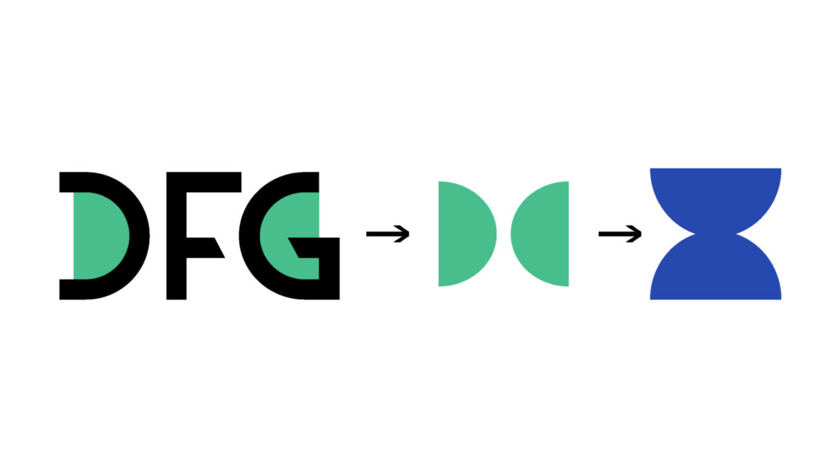
I started from the monogram DFG. The D and G can be seen as two half-circles, forming a balance like a harmonious whole. This led to the creation of an hourglass to reinforce the tagline “Be Wild, Act and Change.” With “Act Now,” I wanted to emphasize that time is ticking, which influenced the hourglass shape. The monogram consists of hand-drawn letters, and for the tagline, the font Agipo Condensed was used. It has powerful letters with a strong identity that exudes activism through its bold angles while remaining accessible and legible.
How do you, as a designer, relate to a creative agency?
I’m primarily here as a representative of Dift. What I find strong about their agency is the teamwork where they don’t just approach the visual side but everything around it to create a powerful brand. It’s not only visually strong but also aligned in tone of voice, thanks to the copyrighting. This creates a well-thought-out whole. It’s something I, as a graphic designer alone, couldn’t achieve. Also, I have the freedom to focus solely on designing without worrying about other aspects, like finances.
And finally, do you identify with or perceive a lack of a platform for design and a history of graphic design in Belgium?
I’ve noticed that nowadays there’s more attention being paid to the history of graphic design in Belgium. There’s a greater emphasis on it, including through projects like ‘Off the Grid’ by Sara De Bondt. It’s interesting to see that in the Netherlands, figures like Wim Crouwel and Karel Martens have a different status than our designers do. For instance, Crouwel could have an exhibition at the Stedelijk Museum, which would be unthinkable in Belgium. In Belgium, graphic design has been somewhat neglected and barely archived, so it’s important that attention is drawn to it now.
What has been preserved is scattered across multiple archives, which actually mirrors the landscape of Belgium. There’s no single style, and everyone is a mix of influences, a cross-pollination. We also do have three languages, which could be a reason that we are seen less as one entity. What happens in Brussels, for example, often does not get through to Ghent.