Project Palace
An eye into Bozar anniversaries
When an institution celebrates its birthday, it is often the moment to look back on its history. Memories, key moments, but also what has been kept in the archives throughout the years. The curator Wouter Davidts and BOZAR invited the Belgian Institute of Graphic Design for a particular event. This celebration concerns the hundred years of existence of the statutes of the Centre for Fine Arts, in 1922, when the building didn’t exist yet (only built in 1928).
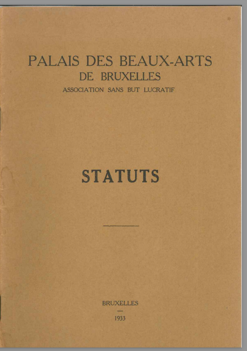
The statutes of the association “Palais des Beaux-Arts de Bruxelles” were printed in a small A5 leaflet. A humble format of a few stapled pages under a brown kraft cover presented the persons and location for the promising centre that was yet to come. The access to a part of BOZAR archives made us more familiar with the structural system of the Centre for Fine Arts. Different organisations were independent for their program while being housed and partially financially dependent on the Centre.
The multiple organisations bring complications to the overall gestion of the archives which have moved a few times during the existence of the Centre. They were first located within the Horta building, then displaced to have additional exhibition spaces. Some parts are located on the other side, at the top floor of the Ravenstein gallery. A part is also located in an external building near Botanique.
This birthday is in the long line of celebrated anniversaries of the Centre for Fine Arts.
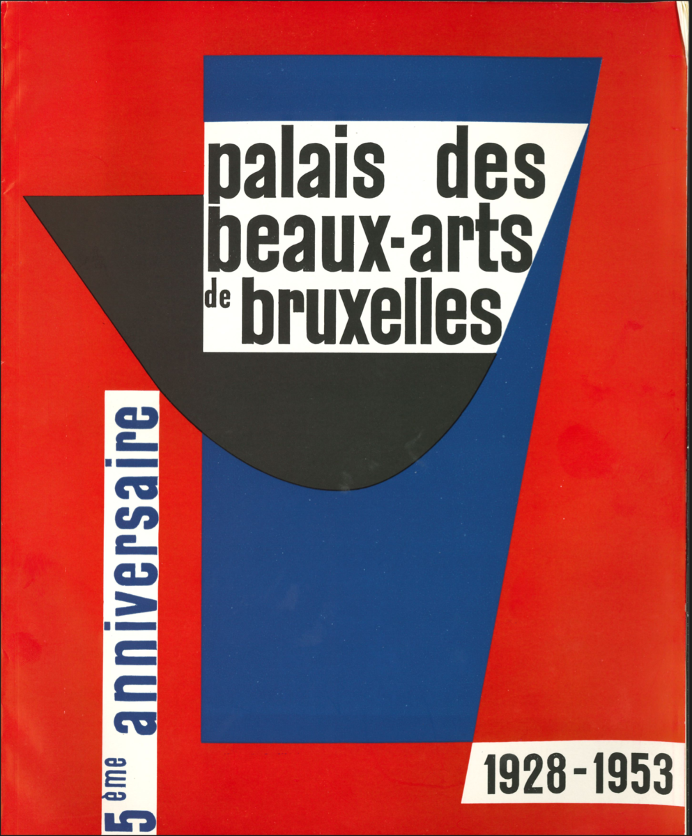
The 80th birthday was celebrated by a remarkable book published by BOZAR Books and Lannoo and designed by Luc Derycke. A consequent work was made to retrace the history of all the exhibitions, concerts, and other events which have taken place in the Palace. The multiple facets of Bozar and its building are presented from different perspectives in English, Dutch and French.
The société philharmonique celebrated the 50 years of the centre with a ballet by Maurice Béjart. The orange brochure presents, not forgetting the 5.000 sandwiches made for the occasion, the main artists with a childhood picture.
A visual reference to Baudelaire’s citation La poésie c’est l’enfance retrouvée, (Poetry is childhood found again).The identity of the Centre for Fine Arts has rarely been consequent because of the many different organisations housed under its roof. Each one had its independence in graphical identity. A striking example is the posters by Raymond Renard, in which an important part of his work can be found online in the archives of the museum of Literature (situated in the KBR). Raymond Renard was born in Auderghem in 1929 and studied at La Cambre. He worked in various theatres taking care of the decors and scenography. Next to this, he also made posters for various theatres in Belgium. He described himself more as an illustrator than a graphic designer.
The series of posters he made for le Rideau, which is today situated in Elsene, are based on the same template. On a black background, the column entrance of the Statues hall is built out of simple forms creating a scene. The entrance door varies from colour and presents on its scene the different theatre pieces and their actors. The posters were used in the 70’s and 80’s. We can also guess that he worked with the other organisations housed in the Centre. The poster kept at the Museum of Fine Arts from 1955 was for the Séminaire des Arts where his illustrations map out the Centre as a cinema and its surroundings as the Royal park and its palace and the Kunstberg / Mont des Arts with a playful handwritten serif typeface.

For the 25th birthday, a colourful book was published, designed by Lucien De Roeck with a cover by Jo Delahaut. Printed by the king’s printer M. Weissenbruch, the publication is a festive celebration with a wonderful use of joyful colours. The publication was an extraordinary supplement to the journal “Beaux-Arts”. Illustrations by Lucien De Roeck of dancers and musical instruments, as the quality of reproduced posters, was an inspiring point for us, researching the celebrated birthdays of the Centre.
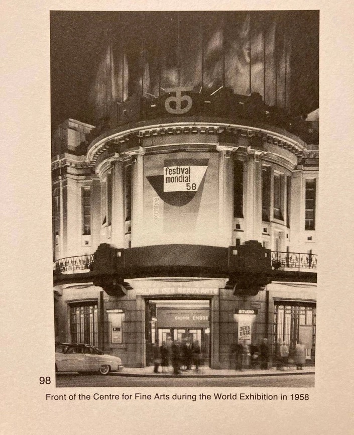

The cover of the book also featured on the facade of the building of the Palace in ’58, for the Festival Mondial which was a satellite to the famous universal exhibition Expo ‘58. This was five years after the 25th birthday of the Centre.
From our fascination with the publication designed by Lucien de Roeck but also the posters for Le Rideau by Raymond Renard we started to think about a colour harmony for the exhibition Project Palace. The different artists would be represented in the colour system, bringing a festive touch to the exhibition. We were looking to revive elements of the graphic design history of the palace. Being fragmented through various formats but also organisations, we focused on one element. We discussed with Bruno Roelandts, archivist at BOZAR about our interest in the colours used in the posters of Société philharmonique de Bruxelles and Société auxiliaires d’expositions for various exhibitions and concerts. He informed us that a similar colour system had already been implemented for communication of the exhibitions. In the 60’s, invitation cards were made using a specific colour system according to the theme or the organisation. He shared with us a folder in which the invitations were kept, perforated. The small format (10 x14 cm), the use of a strong block colour and the setting of a justified text at the bottom of the invitation with the necessary information creates a simple yet strong identity throughout the invitation cards. The large margins and the use of all caps sans-serif typeface brings a contemporary design approach.
Inspired by these playful invitation cards, we designed the booklet and the overall identity as part of the scenography for the exhibition. The typeface in use is MAD sans designed by Dries Wiewauters and distributed by Colophon Foundry.
The original invitations were visible in the exhibition, surrounded by a selected history and contemporary artists that were invited to the celebration. We sadly haven’t found out who is behind this festive and cohesive colour system. If ever you have any leads, we will be very happy to hear about it.


