La Lune Menteuse
Emile De Geyndt
about Not So Difficult
magazine
Pia: Not So Difficult is a new magazine, would you like to introduce it in a few words?
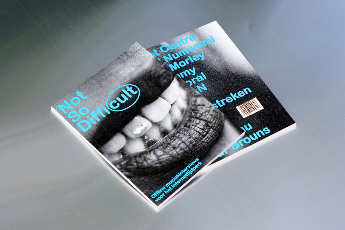
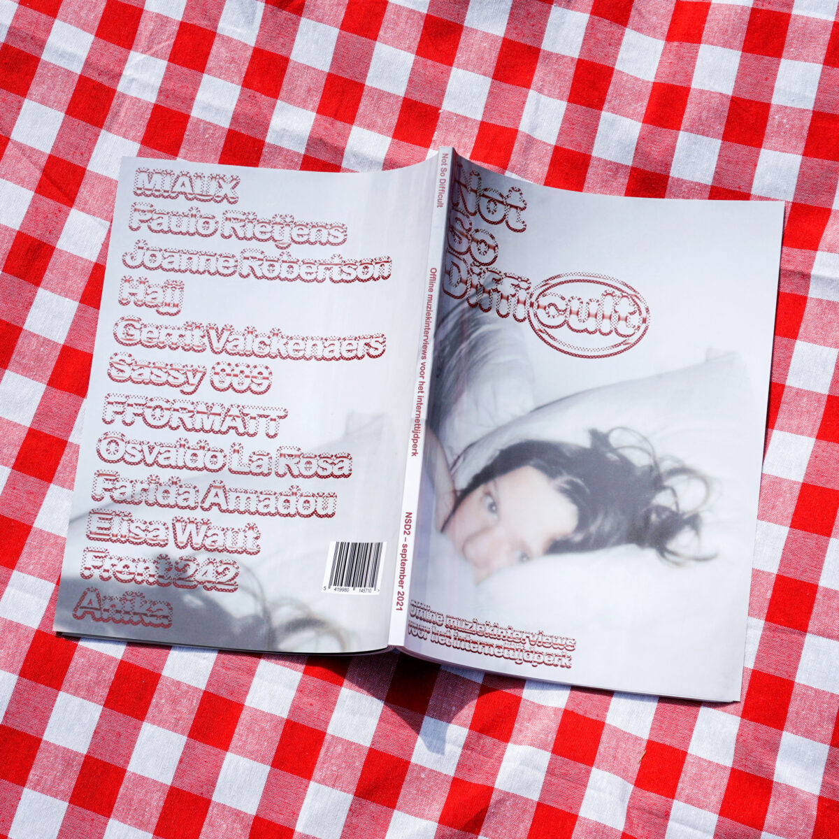
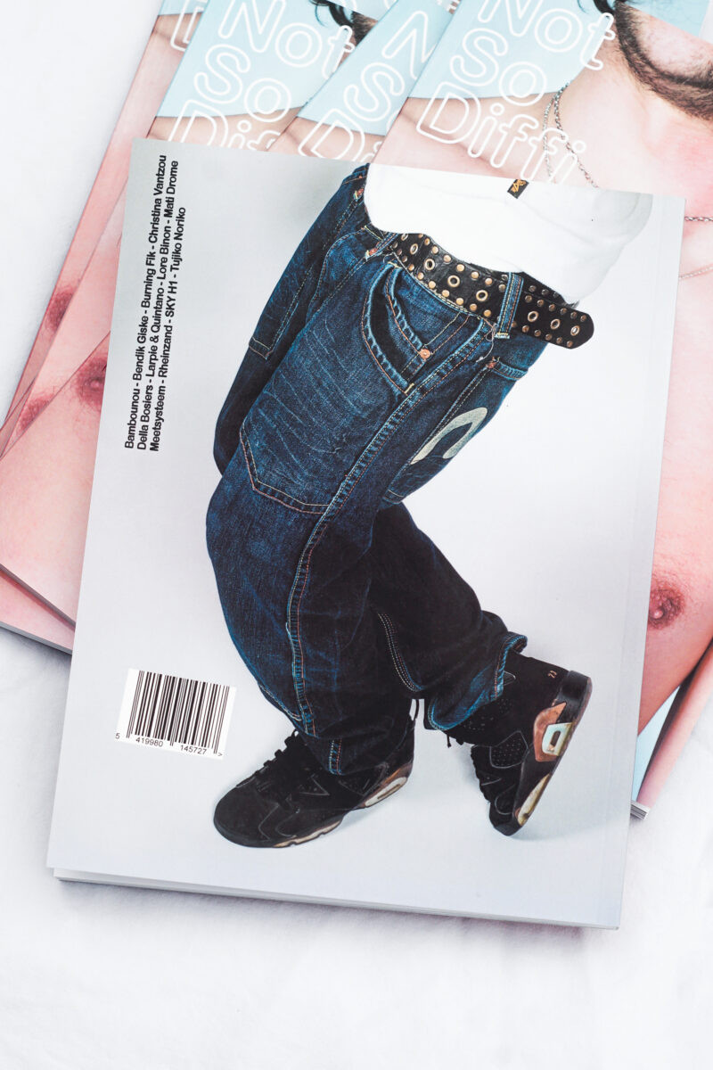
Jente: Not So Difficult is a music magazine that we started in 2020. Our first issue came out in March 2021. It is a printed offline magazine that features 12 interviews with musicians and people who work in the music industry, mainly from Belgium but also from abroad. We pay a lot of attention to the visual aspect that comes into play when making the magazine.
Pia: How many are you in the team? Could you introduce yourself maybe?
Emile: In total we have around 10 ‘core’ members. Jente (Waerzeggers) next to me is editor-in-chief of photography. In the beginning, he took most of the pictures, but now he also directs other photographers and curates their different visions into a cohesive whole. I am the graphic designer. Pieter (Volckaert) is the editor-in-chief, and head of the magazine, let’s say, on a spiritual level. (laughs) Max (Bogaert) does the final edit of the texts, Anton (Dermine) is in charge of public relations and everything of that sort, Nathan (Thys) is our legal aid and oversees the general process of the magazine, Max (Bruninx) takes care of the financial aspects and Indigo (Deijmann) does the social media. Some of us also write for the magazine, but for a large part we’re helped by a group of volunteers that write the interviews or take pictures.
At the moment we actually all work on the magazine voluntarily. Of course it would be nice to see it evolve into something lucrative in the future, but the current situation also forces us to gain from our work in different ways. It’s nice to be free and just experiment with what a magazine can be. I don’t have to pay attention to stuff that other designers would have to, because the team also understands that the magazine only benefits me if I have a lot of creative freedom. I view the possibility the magazine gives me to try out ideas and express myself, and to have those ideas be put out into the world as a form of payment. That’s the case for all of us. What you get out of it is what you put in.
Pia: So, reflecting on the use of images we were talking about before (see interview with Studio Ward Weirhegh) you are free to work with the images and to use them how you want?
Emile: Yes, I do a lot of cropping. I also add a lot of graphic elements from my side. Luckily Jente doesn’t mind. When Pieter and Jente first started the magazine and invited me to do the graphic design, they really wanted the text, the lay-out and the images to be on the same level.
Pia: So the images are more like illustrations to the text?
Emile: I don’t know if you could call them that. Ideally the pictures are strong enough to stand on their own. I think this tension between editorial photography and ‘gallery photography’ is one of Jente’s main focusses. Since we only publish twice a year, we want the magazine to keep its value for as long as possible, and this balance between the visual content and the texts helps that.
The DNA of Not So Difficult is largely made up of that ‘50/50’ balance Pieter and Jente were after since the beginning. But I think now it has evolved into a ‘30/30/30’ split because of the graphics I add while designing.
Pia: We can feel throughout the magazine you are having a lot of fun designing it. Can you talk a bit more about the 30% you add?
Emile: When I was designing the first issue, we had already launched a small try-out version of the magazine. It contained 3 interviews, and consisted purely of text and images. It was a good learning experience because looking back, it didn’t look good at all. So I was struggling to make the magazine more impactful. I wanted to separate NSD© as much as possible from all the other magazines in Belgium. I just knew really well what I didn’t want ours to look like.
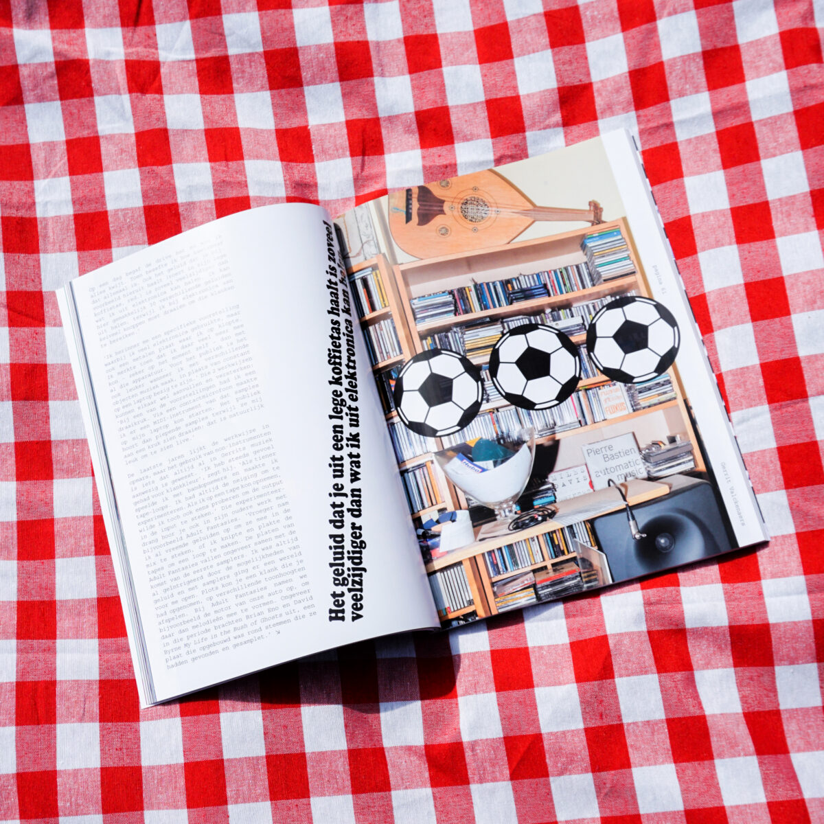
I was working on a type specimen with Otis (Verhoeve) at that time and while doing research, I found this random website with drawings for kids to colour. We didn’t end up finishing that project together, so I still had all these images on my computer when I was designing NSD©. I started sprinkling them throughout the magazine and really liked the result. Sometimes niche projects like NSD© can have a hipster pretentiousness to them, which these drawings dismantled. Of course it also fit our name to make the product fun and light, but more importantly, it made the lay-out bolder and more interesting. Then, because of copyright, we couldn’t use the images. So I asked my brother, Gaspar (De Geyndt) to create about 60 drawings for the magazine and that became the first issue. For the second one, I found a free vector image website, which allowed me to use the actual source material without running the risk of infringing upon someone’s copyright.
I really like to use found images. Both from the internet and what I see in the streets. I am constantly taking pictures and saving jpegs. I collect them all into a single file and slowly a mood develops. The main question then becomes the pairing of those graphics with the pictures and the artists. Because every time things come together, new meaning arises. A soft picture might need an edgy graphic or the other way around. The end stage of the design process for NSD© feels like a puzzle, a matter of finding the right element for each page.
I feel like I never really fully know what I am doing until maybe a month later, when I can see the full picture. Especially for NSD©, because it is so free, a lot of things find their way into the magazine, even if I capture them without that intention at first. Every magazine is a reflection of who I am in that moment.

Pia: I am curious for the team how it is sometimes react to Emile’s vision?
Jente: We started the magazine by constructing the team around it and it was instantly clear that we wanted Emile to be our graphic designer. We knew what we could expect from him. We gave Emile freedom for the design. Of course sometimes we have a back and forth about let’s say who we should put on the cover: do we choose the biggest artist or just the nicest picture…? But I think because Emile and I have similar goals as the visual team and we both find it very important to get away from the conventions that exist around us.
Pia: That is nice to have as a graphic designer!
Emile: I feel like there is never that much discussion. If we are at the fourth issue, it is because we work so well together. If we didn’t, we would have stopped after the first issue, or they would have changed graphic designer.
Leroy: Can you explain the system behind the graphic design? Sometimes, you use several typefaces, or a full spread with text? How important for you is it to constrain to the same system?
Emile: Most of the time, each interview gets a special title font. This font is also used for the quotes in the interview. I used to do three main fonts for the texts, making sure that you never had the same font twice in a row. That way, every interview had its own character, and it made the magazine less monotonous.
For the third issue I stripped it back to one title font and one text font for all the interviews, as that issue was designed to feel more like a photo book than a magazine, with a lot of white space surrounding the images. I also wanted to break the expectations people had of NSD© as the first two were built on the same idea. I think from now on I want every issue to explore a different facet of what makes a magazine. The next issue for example will play with the thinness of magazine paper and what happens when elements bleed through to the other side of the page.
Pia: Are you planning to make the magazine online as well at some point?
Emile: Considering our tagline: ‘offline music interviews for the online age’, I don’t see this happening very soon. Our focus has been on print since the beginning, and we hope to be able to keep it this way in the future. We are working on a website but it is taking a really long time. It is a bit sad but you kind of have to be on platforms like Instagram and Facebook, but we try to keep it to a minimum. The content we post online is never the actual content of the magazine.
Pia: Is the logo also designed by you?
Emile: Yes. I think it was like the second proposal. The font I used for the logo is Arial Rounded Bold MT, with an outline to make it a bit more round than it already is. It was important for Pieter and Jente that the wordplay of Diffi(cult) was made visible. They had written it with parentheses around cult, and I thought connecting the parentheses into an oval would be nice. That way, when we abbreviate the name, we can use the copyright logo for the c, so it becomes NSD©. I like Arial Rounded because it has a childish vibe, almost like a comic sans but cleaner. It fit in with the not so serious vibe I wanted to create, while still being basic enough to be reinterpreted for every issue.
Leroy: You also brought a Not So Difficult mug with you, could you tell us a bit more?
Emile: I remember we wanted to make merch and were searching for items that fit with the idea of a magazine, and were also not too gimmicky or wasteful. We found out we could print mugs so that’s what we ended up doing. The graphic is a small cottage in the country side with a rooster crowing ‘NSD©’. You read the magazine comfortably, at home, maybe for breakfast, with a coffee or a cup of tea. Very cosy vibes.
Leroy: Maybe one last question. Do you listen to the music of the artist when you are designing his or her interview?
Emile: No. (laughs) I have my own music I like to design to. I do discover music through the magazine though, as I’m not really the one picking most of the artists we interview. But I feel like I can distil enough from the text and the pictures to create the right atmosphere for each artist.
I also even find it hard to read it sometimes. To enjoy the magazine as a product after it has launched. I don’t know if other graphic designers have the same problem. After working on it so intensely and reading the interviews diagonally while designing, it takes time before I’m able to consume it like a reader. Even then, I mainly end up noticing small mistakes and cringing. But then it’s time for the next one I guess.
Leroy: Thank you. Thank you for the interview and for telling us a bit more about the identity and the Not So Difficult lifestyle.