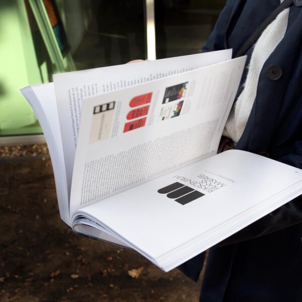
The Logo of the Frans Masereel Centre
The Power of a
Timeless Emblem
Translated from the article published in Flemish
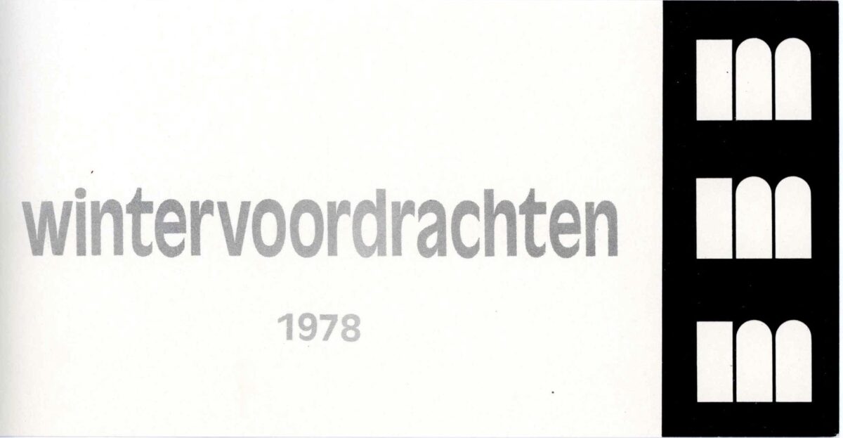
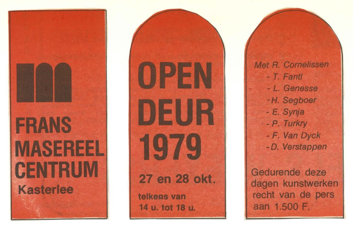
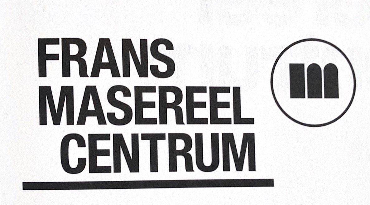
When the Frans Masereel centre opened its doors in Kasterlee in 1972, it almost immediately got its own logo. To this day, the logo is still the recognition point for the Centre. It consists of three standing blocks that are horizontally aligned and uniformly darkened. The three blocks are the same width and height, but differ in shape. The left block is a rectangle, while the other two blocks have an arch-shaped upper end. Together they read as the letter ‘M’, an involuntary reference to the institute’s name. Remarkably, this block-shaped image suggets a building in a subtle way, although there is no immediate link to the Centre’s specific spherical architecture. The architectural character of the logo could be considered a reference to living and working within the FMC, although one cannot be sure whether this was the actual intention of the designer. The logo can be found on various internal documents of the Centre such as (annual) reports, outgoing mail, signs and the embossing stamp used to mark all the artworks produced during the residencies. The non-profit organisation ‘The Friends of the Frans Masereel Centre’ also placed the logo on their official stationery. It was also used from the very beginning as a graphic element on invitations and posters for all kinds of events organised by the Centre, such as exhibitions, open days and other gatherings. It is striking how the logo was often handled in different ways and integrated into the design. For example, it was multiplied, changed in size, or padded with text.

In all likelihood, we can identify Paul Voet as the designer of the FMC logo.4 The logo for the CM (Christelijke Mutualiteit) – also still in use – constitutes one of the best-known designs by this Belgian graphic designer. Voet belonged to a new generation of designers – along with S+S Alouf, Boudewijn Delaere, Corneille Hannoset and Jeanine Behaeghel, among others – who developed their own visual language that was completely new. Characteristic of their designs created in the 1960s to 1980s was the combination of typography with illustrative craftsmanship.5 Most of Voet’s surviving work consists of illustration work, ranging from designs for book covers to illustrations for children’s books.6
A striking example of how Voet combined illustration and graphic design is a design for the FMC from the 1970s. This design would recur several times on posters for exhibitions organised by the Centre. Undulating and multicoloured shapes create a band at the bottom of the poster, contrasting sharply with the bright logo and text in a sans serif font.7 These posters were also signed by Voet.
Since the logo’s inauguration in 1972, the original design has remained virtually unchanged. The logo has been used both as a stand-alone figure, as well as accompanied by the Centre’s name written in its entirety. Noteworthy is that the typesetting and font of the designation evolved over time. For instance, the font changed from a serif font to various sans serif fonts and from capital to lowercase typography. The alignment of the words also changed several times: sometimes to the right, sometimes to the left, or placed underneath each other. The choice of typeface often seems to be related to the graphic trends of the time. The use of serif to sans serif fonts was an important shift in the development of the ‘logo image’, where the name and the form are seen as one. Remarkably, fewer and fewer capitals were used for the name in order to place it on equal feet next to the logo. This idea is in line with the tradition of using lower-caps among Dutch graphic designers, such as Piet Zwart. They were convinced that by using lower-case typography, the words reflected a fundamentally anti-hierarchical attitude.8 This involved rejecting all capitals and considering titles as equivalent to the full text.

After the design of the logo by Paul Voet, the Frans Masereel Centre does not seem to have had recourse to a regular designer, resulting in a lack of consistency in design. Although, as mentioned, Paul Voet created a template for some similar posters during the 1970s, the Centre’s communication in the decades that followed is characterised by very different design styles. Artists such as Martin Baeyens, Marc Verstockt and Paul Turkry – who by the way all resided at the Centre – designed different posters for exhibitions organised by the Centre in the 1980s and early 1990s. Their designs are often in line with their respective artistic practices. For instance, Verstockt designs a poster in black and white with its recognisable grid structure – note that he omits the logo and replaces it with a clear letter ‘M’ – and Baeyens restricts himself to monotonous, almost abstract collages, among other things. The leaflet he designed for the 1988 open day shows a harmonious composition using the simple shapes of the logo with sans serif letters.
In the years that followed, with a few exceptions, the Centre worked with a fairly standardised layout for the exhibition invitations. The front of the folded card always features a work by the exhibiting artist and inside, the informative section appears in sans serif lettering. On the back, the Centre’s logo is replaced by the one of the Flemish Community.
It was not until 2011, shortly after Sofie Dederen took over as the Centre’s new director, that graphic designer Raf Vancampenhout started reflecting on a coherent house style.10 The logo was minimally modified by placing a circle around the existing three block-shapes. This updated logo fitted into a completely new graphic identity that extended to all printed matter, as well as to the updated website by Vancampenhout (in collaboration with Lauren Grusenmeyer). The printed matter is organised according to a fixed pattern with colours and a multitude of thoughtful folding methods. 11 This renewed style of communication nevertheless remained recognisable by maintaining the original logo (ill 12 Logo on printed matter renewed house style van campenhout).12

A new house style was also introduced with the most recent change of director in 2020, with an accompanying updated website. Initially, together with graphic designers Jore Dierckx 16 and Lieselot Verdeyen17 – from Studio.dier and Studio Mast respectively – a new logo was considered.18 In the end, Voet’s 1972 design was only minimally modified. The accompanying font for the institute’s name is redesigned, however, so that it stands firmly with the logo (ill 13 Logo mast and dier). The choice of lower-case typography here reflects a substantive consideration. Director Stijn Maes wants the Frans Masereel Centrum to be ‘less loud and to bring about a more supportive function’.19 In doing so, it is important to radiate accessibility to visitors to the Centrum as well. By excluding capitals in the logo image, they aim to prevent any form of hierarchy.20


1Thanks to the fundamental work ‘Logobook’ by the pair of graphic designers Paul Ibou and Liliane- Emma Staal mapping national and international logos, we can deduce that Paul Voet designed the FMC logo. Paul Ibou, Logobook 200, (Zandhoven: Groep Interecho, 1986), no. 288, n.p.
2Herman Lampaert, Klara De Smedt, Christian Kieckens, Christian Lapinne, Johan Valcke, Koeien in Letters, 1998, Brussel: VIZO, p. 92.
3Archives consulted under the name of Paul Voet at the Royal Library KBR and KADOC Leuven, 2021.
4Thanks to the fundamental work ‘Logobook’ by the pair of graphic designers Paul Ibou and Liliane- Emma Staal mapping national and international logos, we can deduce that Paul Voet designed the FMC logo. Paul Ibou, Logobook 200, (Zandhoven: Groep Interecho, 1986), no. 288, n.p.
5Herman Lampaert, Klara De Smedt, Christian Kieckens, Christian Lapinne, Johan Valcke, Koeien in Letters, 1998, Brussel: VIZO, p. 92.
6Archives consulted under the name of Paul Voet at the Royal Library KBR and KADOC Leuven, 2021.
7Sans serif letters are letters without serifs. By serifs, we mean the transverse lines at the end of a letter. Fonts such as Helvetica or Arial are examples of sans-serif fonts. Serif fonts do have serifs and are mainly used for longer texts in books or newspapers. Times New Roman is probably the most recognisable serif font.
8Wim Crouwel, “Onderkast in nederland”, De Gids (Jaargang 156, 1993), p. 302.
9Wim Crouwel, “Onderkast in nederland”, De Gids (Jaargang 156, 1993), p. 302.
10‘Selected work: Frans Masereel Centre’ https://www.rafvancampenhoudt.be/fmc-various.php , consulted on 20.11.2021.
11Identity guide, Raf Vancampenhoudt, consulted in the archive of FMC.
12Idem.
13‘Selected work: Frans Masereel Centre’ https://www.rafvancampenhoudt.be/fmc-various.php , consulted on 20.11.2021.
14Identity guide, Raf Vancampenhoudt, consulted in the archive of FMC.
15Idem.
16Visual Identity Frans Masereel Centrum, https://studiodier.com, consulted on 20.11.2021.
17Visual Identity Frans Masereel Centrum, https://studiomast.be/work/frans-masereel-centrum, consulted on 20.11.2021.
18Transcription interview of Stijn Maes by Paula Rodriguez Sardiñas and GertjanDecock, 02.10.2020, Van Grafiekdorp tot Kunstenlabo: De Presentatie en profilering van het Frans Masereel Centrum (1972-Heden), Gent: Ugent, 2020-2021, p.47.
19Transcription interview of Stijn Maes by Paula Rodriguez Sardiñas and GertjanDecock, 02.10.2020, Van Grafiekdorp tot Kunstenlabo: De Presentatie en profilering van het Frans Masereel Centrum (1972-Heden), Gent: Ugent, 2020-2021, p.46
20“Frans Masereel Centrum in een nieuw jasje! Nieuw logo, nieuwe visuele identiteit, nieuwe website,” consulted on 24 april 2022, https://fransmasereelcentrum.be/nl/het-fmc-in-een-nieuw-jasje/.