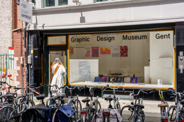
The evolution of the identity of Design Museum Gent
Once called Museum voor Sierkunst, Museum voor Sierkunst en Vormgeving, or Museum voor Sierkunst en Industriële Vormgeving, Design Museum Gent has had various names. Each name reflected different visions of what the museum should be. In its early years, there was no overall identity as we know it today. Some designers, like Frida Burssens, worked multiple times for the museum, and templates designed by Octave Landuyt were used for different exhibitions.
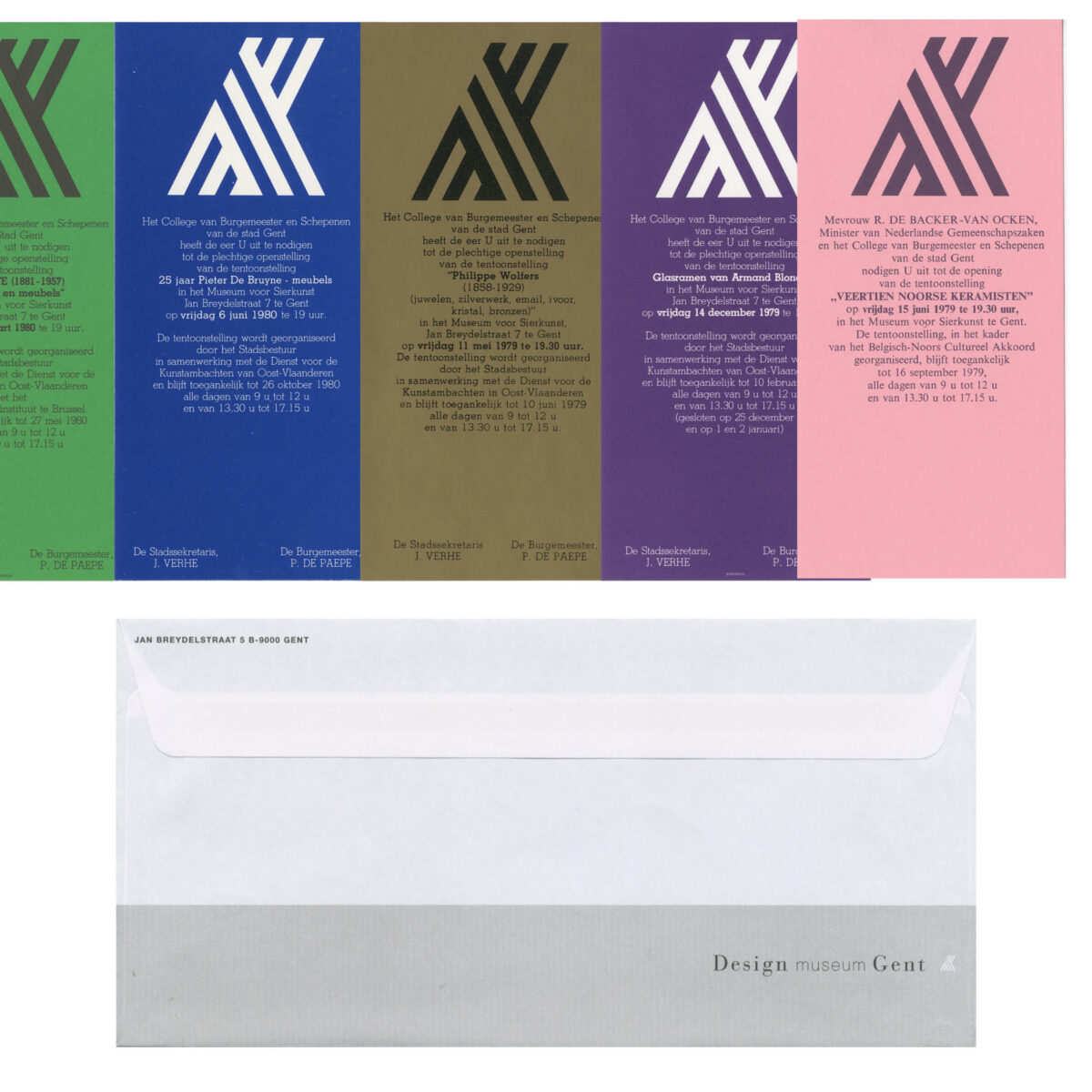
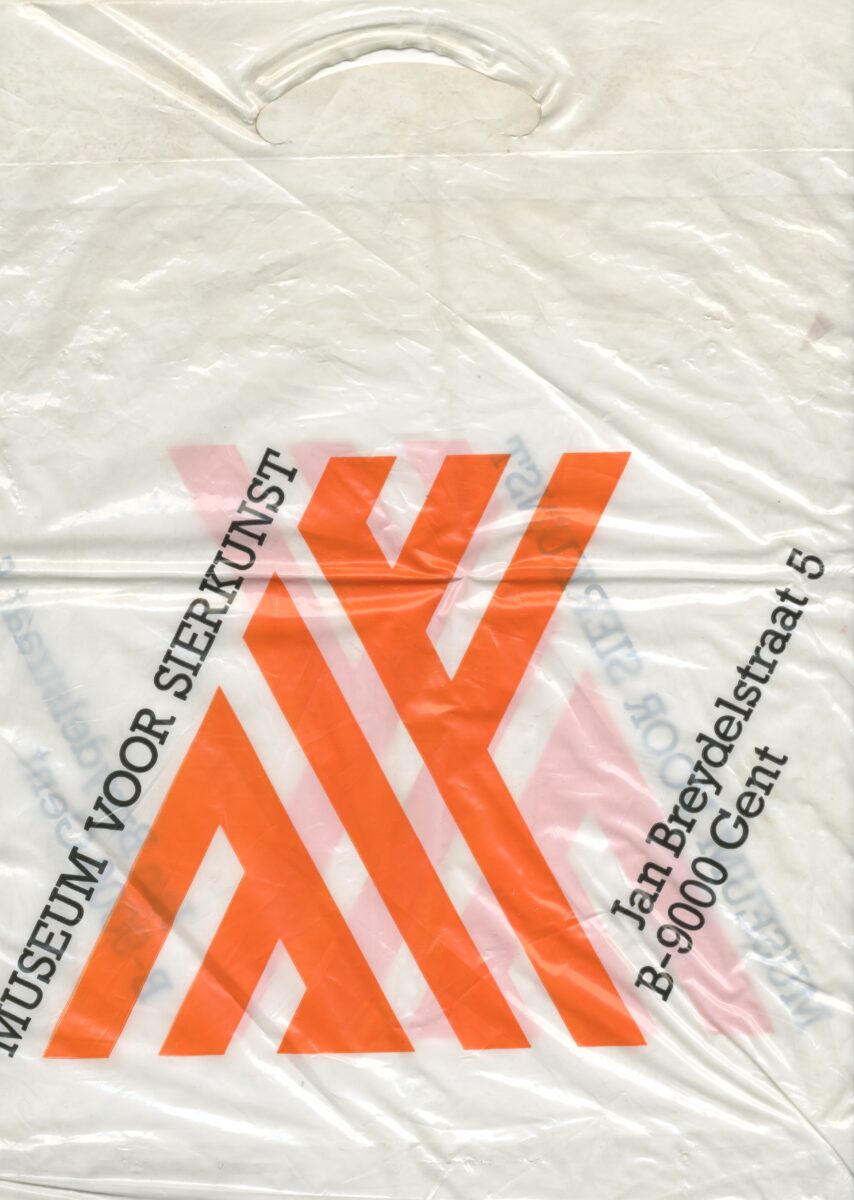
Changing the name of a museum goes hand in hand with a new identity. The renaming to Museum voor Sierkunst in 1977 marked the establishment of a more cohesive and recognisable identity. In the same year, Piet Vandekerckhove (1945-2015) proposed the logo, which is still used today with minor changes. The logo consists of three diagonal lines in two opposite directions. The lines extend to a horizontal point on the left side, while on the right side, the lines are cut at their intersection. The use of the slab serif font called Rockwell, designed in the 1930s, with an often tight letter spacing accompanied the logo. Some say that the merging of the ‘K’ and ‘A’ in the logo represents the original organisation of Design Museum Gent called ‘Dienst voor de Kunstambachten in Oost-Vlaanderen vzw’.
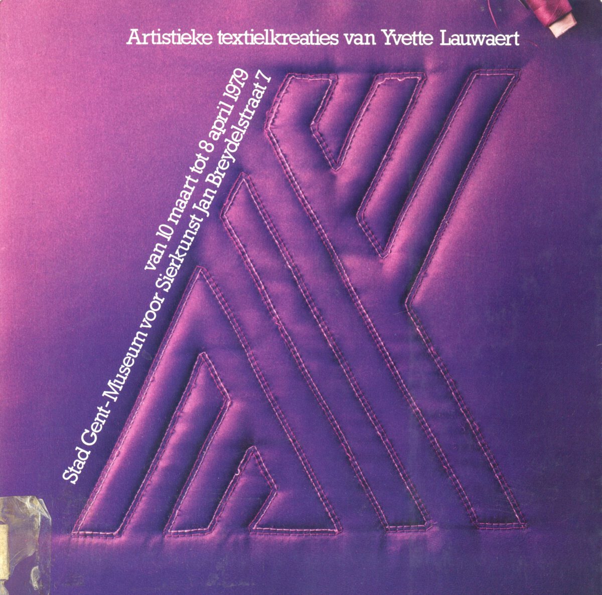
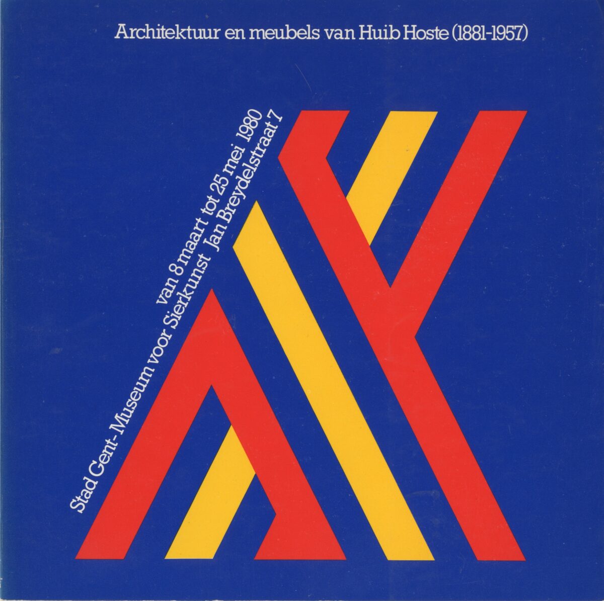
In the 1970s and 1980s, the logo played a prominent role in the overall identity. The printed materials from this period featured the logo made in different textures, sometimes using bright colours or it represented a material, depending on the context. The title and additional information were repeatedly set at the top and bottom of the logo. Many of the ‘material’ logos were physically produced, while others were simulated. Vandekerckhove demonstrated great versatility in evoking the form of the logo. Over the years, the logo was reproduced as jewellery, as well as in ceramics, paper, glass, aluminium, textile, and sand. This added an extra layer to the identity of each unique exhibition. Despite variations in colour and template, they formed a thoughtful and cohesive whole.
For each exhibition, Design Museum Gent published square-shaped catalogues. The cover featured the same image as the posters, with the title positioned in a similar composition at the top. The lay-out inside the book was made by working with a consistent grid of vertical lines dividing the columns and images. While rational, the grid was sometimes challenged by the designer and the content, showing Vandekerckhove’s ingenuity. The flyers and invitations were more simple, with varying colours of paper and the logo in black.
From 2002, under the supervision of Vandekerckhove & Devos, a stricter identity was implemented. The logo became smaller and white, combined with the new name of the museum, Design Museum Gent. The words ‘Design’ and ‘Gent’ were set in a serif didone typeface, while ‘museum’ in lowercase, was set in a sans-serif typeface. The posters featured close-up studio images of objects on grey or black backgrounds. The title was placed at the top of the picture in the sans-serif typeface.
This identity was used on all the museum’s communication items such as envelopes, business cards, and letters, until 2014. The contrast with the previous identity is significant and represents a radical change. With the new name ‘Design Museum Gent’, the design was strongly influenced by the intention to expand the scope of the collection and reach a wider audience. The focus shifted from craftsmanship to design objects and culture.

Piet Vandekerckhove’s involvement with the museum changed throughout the years due to the evolution of his career. For this reason, we can identify various signatures on the printed materials. Piet Vandekerckhove began his career as an independent designer in 1978 when he established his firm as Vandekerckhove & Co. The name would later change to Vandekerckhove & Van Zandweghe. At that time, he worked with copywriter Erik Van Zandweghe, who exclusively wrote texts. Subsequently, their partnership ended, and the name became Vandekerckhove & Co again. In 1990, Michel Devos joined Vandekerckhove, and they formed Vandekerckhove & Devos. In 2000, the company had 40 employees. This collaboration continued until today, even after Piet Vandekerckhove’s passing in 2015.
Design Museum Gent has known many identities since the start. This can be explained by the growth of the public and the collection. From its early days until the first establishment of the Museum voor Sierkunst, and its name changes, the museum’s visual identity has known different transformations. The iconic logo, with its diagonal lines and distinctive typography, symbolised the museum’s capacity to adapt. The contributions of Piet Vandekerckhove have left an indelible mark on the museum’s graphic identity through a recognisable and versatile symbol.