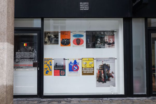
O is not a circle
Without beginning or end, the circle symbolizes infinity, the group, the perfection. The closed shape is also a clear barrier between inside and outside the circle. Due to the lack of strong edges or sharp corners, the circle brings a playfulness, the rounded shape suggests movement, and it’s powerful simplicity has a decisive effect within a design. A point, sphere, dot, oval, the letter O or an ellipse: with its many appearances, there are countless ways to incorporate the circle into a design.
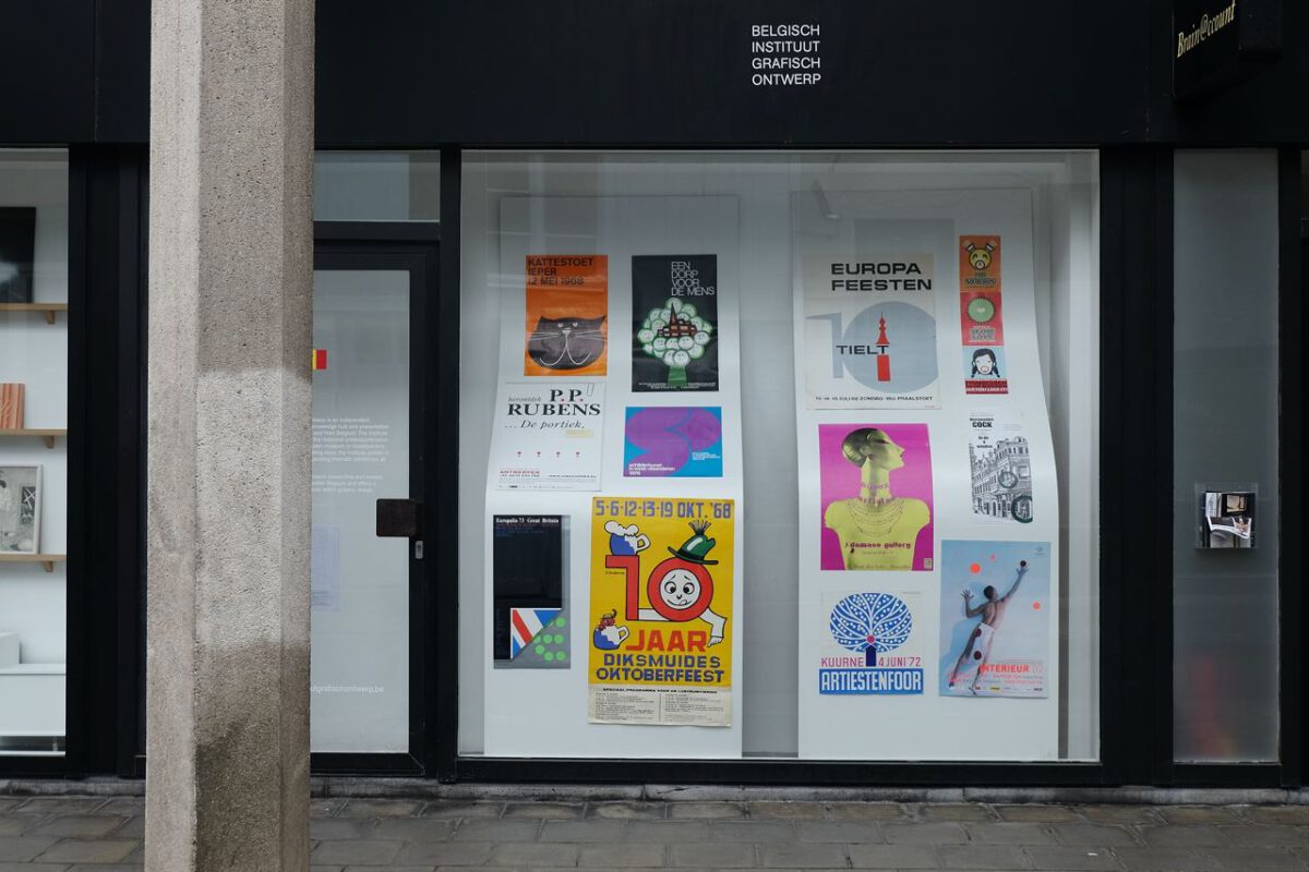
With a curious eye, the exhibition O is not a Circle searches for differences between form and typography, for similarities between foreground and background, and for the limits of shapes.
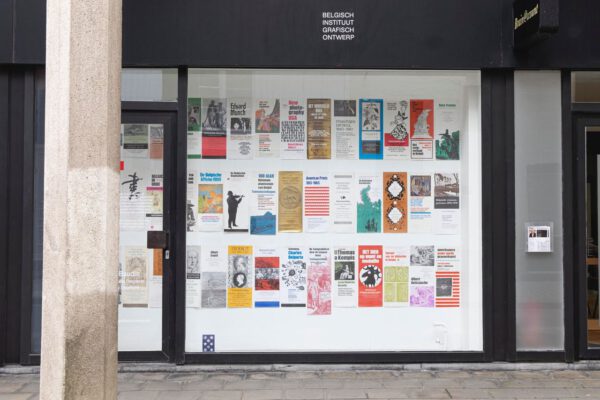
Based on the elementary shape of the circle, the Belgian Institute of Graphic Design connects a series of posters from a private Brussels collection. In the showcase of the Rossicontemporary gallery, an idiosyncratic presentation posters is created, regardless of period, situation or designer.
This exhibition took place thanks to the art gallery Rossicontemporary.
