La Lune Menteuse
Anton Pereira Rodriguez
about Jan Vercruysse’s
“Belgisch tijdschrift
voor Kunst”
As the moon affects the tides, the Belgian Institute of Graphic Design settled at the cabin of PLEASURE ISLAND in collaboration with HARING BOOKS. During this event, we invited editors and graphic designers to uncover their perspectives on three independent magazines. Anton Pereira Rodriguez introduced the day with Jan Vercruysse’s project for a Belgian art magazine, which never saw the light of day. Anton Pereira Rodriguez is an assistant in the Department of Art, Music and Theatre Studies at Ghent University. He is working on a doctorate on artistic and institutional exchanges between Italy and Belgium in the 1980s and 1990s, focusing on Jan Vercruysse.
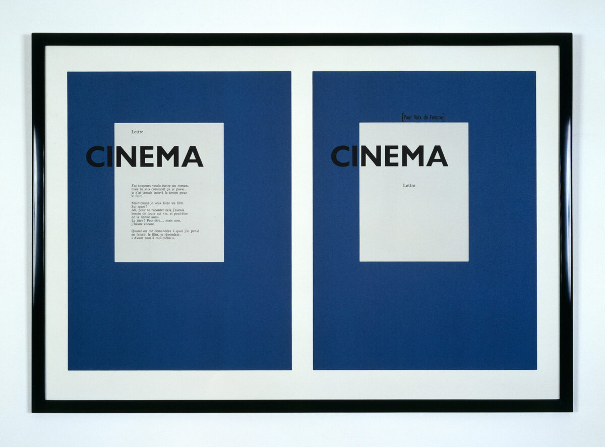
In 1992, Jan Vercruysse conceived an edition entitled ‘Cinema Cinema’. The work consists of two white surfaces over a blue background, the left panel contains a text:
“J’ai toujours voulu écrire un roman mais tu sais comment ça se passe, je n’ai jamais trouver le temps pour le faire”.
So this work is actually about the artist’s desire to write a novel or create something but not find the time for it. Actually, we could replace the word novel with the word magazine -that is, after all, the subject of my lecture today, namely Jan Vercruysse’s unfulfilled wish to publish a magazine. So unlike the contributions later this afternoon, I am not going to talk about an existing magazine, nor about a magazine published by a graphic designer. In fact, it is a magazine that never existed. Yet, it is actually not that strange because Jan Vercruysse was actually a graphic designer too. Before starting as an artist, in 1977, he aspired to a career as a poet, more specifically a visual poet. His poetry consisted of collages in which he played with typographical elements.
He later also used his graphic design experience during his time running a gallery in Ghent, the Elsa Von Honolulu Loringhoven-Galerie (1974-1976). For his gallery, Vercruysse designed membership cards, invitation cards and for each exhibition he also published a small booklet.

In addition, he also designed catalogues for artists, for example for Peter Downsbrough, who exhibited at his gallery in 1975. In 1982, Vercruysse did the graphic design for a monograph of Romanian/French artist André Cadere. Vercruysse also consistently designs his own exhibition catalogues.
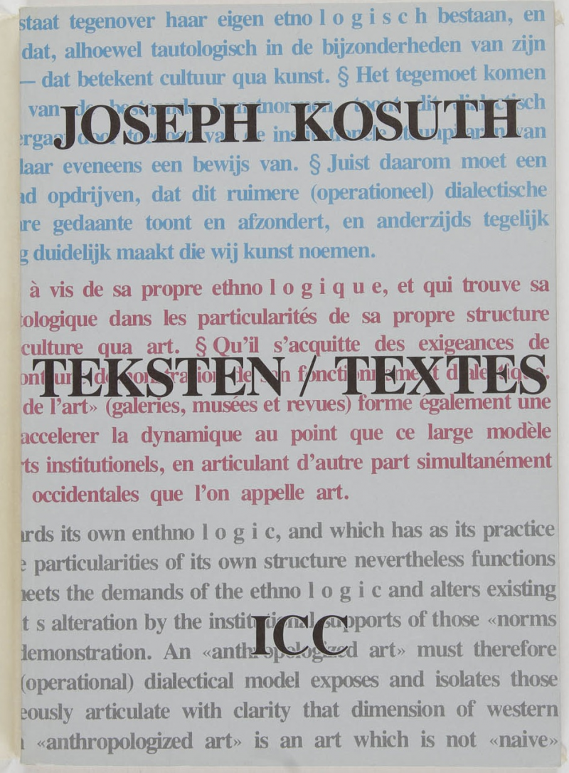
Whereas initially he invited local, friendly artists to exhibit in his gallery, his programme soon evolved towards more international conceptual artists, such as André Cadere and Joseph Kosuth. Once he got to know conceptual art, he deepened his knowledge about this art movement and read almost everything by Kosuth, Art & Language, Daniel Buren, and so on. He not only reads the texts of Kosuth and the Art & Language group, but also translates them, respectively for the ICC in Antwerp and the Van Abbemuseum in Eindhoven. So he knows the texts like the back of his hand. However, he does not stop at just studying them, but also immediately formulates some comments on them. Initially, his commentaries were purely for private use in his many cahiers. In one of his notebooks, we find a commentary on the magazine of the Art & Language group. He writes about it:
“ The journal has evolved from readable, useful, clear, enjoyable analyses, inquiries, viewpoints, texts, understandable to many, to unreadable, unhelpful, unclear, ungenuine, with gossip columns, tea party talk, helter-skelter analyses, colossal philosophy, pretty navel gazing.”
Later he also published two texts formulating his reservations about the art of the 1970s, namely in the catalogue of Jeff Wall’s exhibition at Bozar in 2009 and in the GEWAD magazine in 1980. In the latter magazine, moreover, Vercruysse publishes two other art criticism texts, on André Cadere and on Lili Dujourie.
Vercruysse is therefore engaged in art criticism, and so it is not surprising that he comes up with the plan to start a magazine. But before I want to delve deeper into the magazine, it is not a bad idea to first look at the art magazine landscape in Belgium during the late 1970s. After all, in the 1970s there are hardly any specialised art magazines. On the one hand, there is the Brussels-based, French-language magazine +-0, which focuses mainly on conceptual art, and on the other hand, there is the “Art & Culture Agenda” published by the Brussels Palace of Fine Arts. The latter is mainly an informative magazine about the Palace activities and contains very little real art criticism. Most “art criticism” could be found in newspapers. For Vercruysse, the lack of a proper art criticism in Belgium was a source of irritation. In a debate organised on the occasion of the exhibition Inzicht/Overzicht: Contemporary Art in Belgium, at the Museum of Contemporary Art in Ghent in 1979, Vercruysse offended the art critics present by arguing that there are no art critics in Belgium, but “at most art journalists or reporters who happen to write about art”.
So it is not surprising that in the late 1970s and early 1980s Vercruysse conceived the plan to start his own art magazine. The reasons could thus be:
1) Out of dissatisfaction with current Belgian art criticism
2) Due to the lack of a solid landscape of art magazines in Belgium
3) Because of its own ambitions as an art critic
4) Jan Vercruysses passion for graphic design
Vercruysse’s archive contains several sketches for a magazine. A few draft pages contain some ideas. These include the idea of a magazine with the provisional title: “Journal for the study of art practice or something like that” which would have consisted of:
1) Translations of texts by Baudrillard, Lyotard, Adorno, and so on
2) Reviews of journal articles in e.g. Critique, Revue d’Esthetique and Cahiers du Cinema
3) Bibliography of all that is published
In his notes, Vercruysse stressed that this would not be an art journal discussing exhibitions, but a periodical that informs and focuses on art theory.
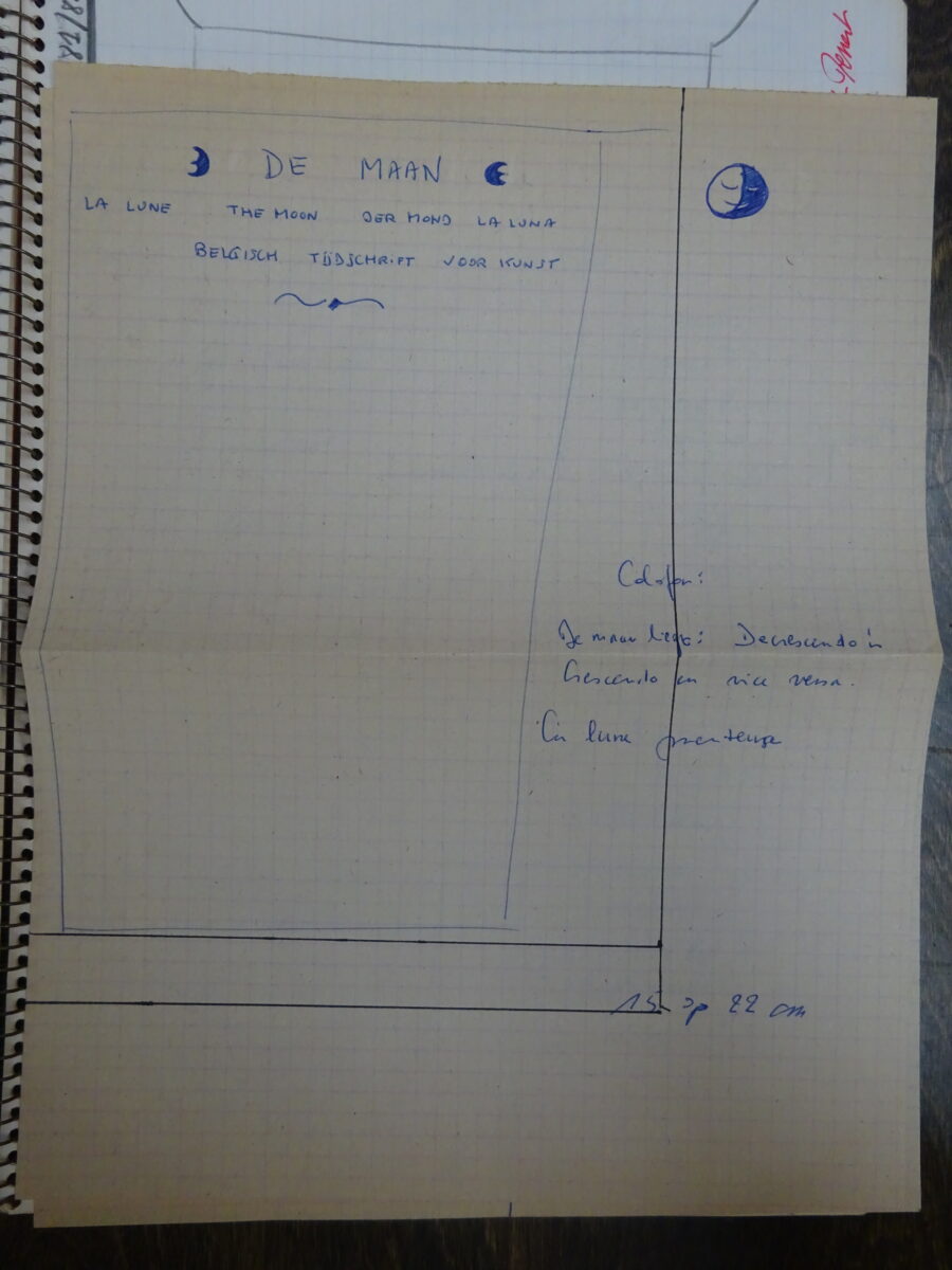
Then there is a second magazine that Vercruysse wanted to establish and he had also already created more of a kind of graphic design for that, there is an sketch of it. It was also the title of the event today: The Moon and then both in French: La Lune, English The Moon, German: Der Mond, Spanish: La Luna. “A Belgian magazine for art” is written on the front cover. The cover should then feature a reproduction of a painting by Jan Van Eyck or Rogier van der Weyden, i.e. the Flemish Primitives. Another sheet lists the content of the magazine: works by certain artists, interviews, texts about exhibitions, reviews and he also mentions all artists who would be considered.
This list is actually quite striking: it ranges from Francesco Clemente to Mark Luyten, and Julian Schnabel, Bertrand Lavier; so basically all of them are artists who cannot exactly be linked to Jan Vercruysse. Then we also read that he wants to compile a dossier for some artists: Lili Dujourie, Didier Vermeire, Jacques Charlier and Philippe Van Snick. All befriended artists. Then there are interviews with, again, Julian Schnabel, Bertrand Lavier and Garouste.
Finally, there is a section on art history or theory, with, for example, a chapter on Mannerism. So it is a very ambitious project. So as I started at the beginning of my lecture with the work Cinema Cinema, which is about not finding the time to write a novel, Vercruysse also did not find the time to get the magazine launched. A possible reason for this could be, financially, but also the ambition of the project and lack of time. After all, Vercruysse’s career as a visual artist takes off in the early 1980s.
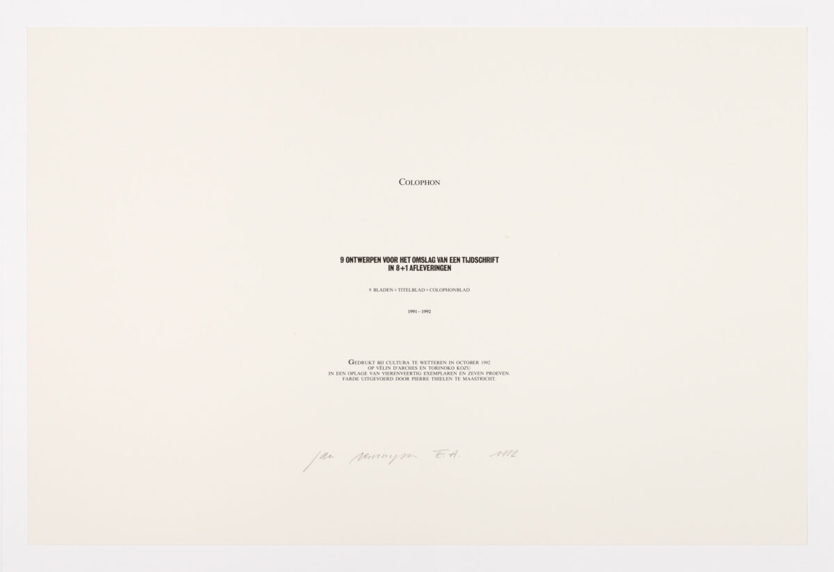
So then, 10 years later, he takes some kind of “revenge” for that fact that he never got to do a magazine after all. When he tells Yves Gevaert, the Brussels publisher of editions by Marcel Broodthaerts, Rodney Graham and Lawrence Weiner, among others, his plans about the magazine. Yves Gevaert encouraged him to at least design the covers of the magazine as an edition. The result is the edition titled “9 Designs for the cover of a magazine in 8+1 issues”. These designs reflect his passion for graphic design. It is a complete ensemble, so it is always shown together. The title page, the titles of the magazine. Each magazine carries the name of a woman in art history. These include Aphrodite, Atalanta, Beatrice -from Dante-, Cleopatra, Helena, Judit, Lilith, Phryne and Alice -from Alice in Wonderland-. Again, a lot actually comes together from Vercruysse as many of the covers refer to the Tombeaux series where he acts as a graphic designer, has designed his own font and uses fine line drawings.
This is the magazine Jan Vercruysse designed after all, even if it is not properly speaking a magazine. Like the edition Cinema Cinema, with which I started the lecture, this work is also about trying to undertake something.