La Lune Menteuse
Ward Heirwegh about
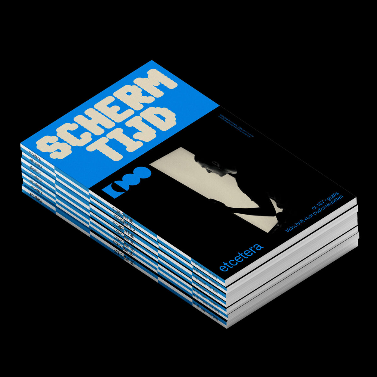
Etcetera magazine

Leroy: Hello everybody, we continue with Studio Ward Heirwegh who will talk about Etcetera magazine. Etcetera magazine is about performance, theater in Flanders. It started in 1983, and you started with the design in 2014?
Ward: No, actually in 2017. I was going through my archives and realized it was already 5 years!
Leroy: I am curious about how you made the new identity of the Magazine. The former graphic designers were Van Looveren & Princen. How did you create the new design? What was the pitch they gave you?
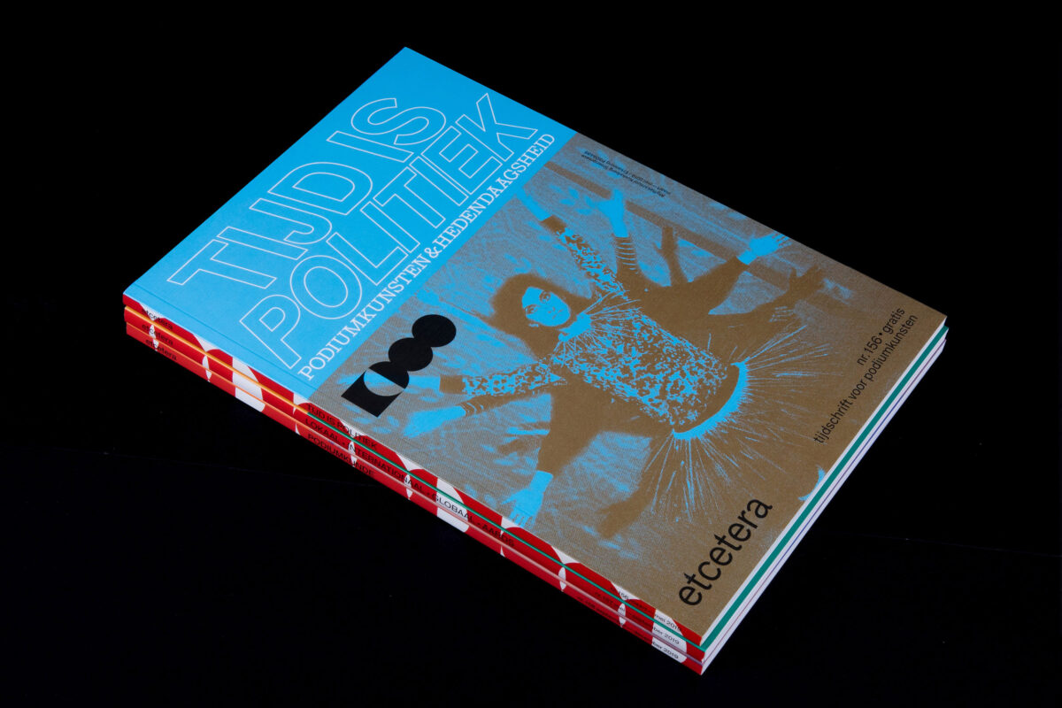
W: There was no pitch. Basically what happened is that there was a complete overhaul of the team of Etcetera, so new people came onto the editorial board. I think the executory board also changed, at that time. I knew some of them through “Bâtard”, a theater festival for young makers, which was happening at that time at Beurschouwburg in Brussels. The goal was to do the magazine in a completely different way. Etecera was seen as a bit dusty, with a heavy focus on the big houses, not leaving a lot of room for younger makers. So when the new team came on board with the plan to do things differently, they also needed a new graphic designer. So we started talking about doing the redesign and they simply asked me to join them. So that is how it happened, there was never a competition or a pitch, which was actually really nice.
Leroy: Was it the first magazine that you designed? Did you previously make some magazine design or editorial work?
W: There were a couple of tries to do a magazine but that never really worked out well. There was one effort called Toop, but that’s really a long time ago. And it was only around 40 pages or so. So this was the first time for me to work on a design that can repeat and adapt itself over time. Due to the fact that magazines are periodical you have to think differently as a graphic designer. If you’re making a one-off, you are going to look for the best solution. But if you are working on a magazine, you are thinking for the best solution within the framework of time. It is another way of approaching those design questions. Some specific solution might work for a cover this one time, but will it be impossible with the next issue when we have less intriguing imagery or something. The limitations are different. They’re not worse but just different and that is what makes it interesting. There’s also a budgetary aspect that comes into play. In the beginning, the magazine was much bigger in format, for example, but we lost some funding so we had to divert to the classical 17 x 24 format. Then we lost a bit more funding, so we had skip having a spine on the magazine and move to having some issues stapled together. After this, corona hit and this also had consequences. So, one issue of Etcetera was never printed and only exists online. You’re always adapting to things being in flux. So, as a designer, you try to come up with set of rules that allow you to adapt to these situations.

Pia: Normally the magazine has a lot of reviews about theater pieces. During corona, texts were then written especially for the magazines on broader topics within performative arts. Was it for you another way of working for you?
W: No, because in a way you want to keep your head up and you want to continue the same path as you would before. Content-wise it is obviously different. The theaters were closed so no reviews could be written about the performances. What the team did is that they really went in depth with the theater makers, talking about their inspirations, about where they get their information from,… This didn’t reflect in the design, except that it is stapled issue and so without a spine. We did have some small hickup. With this redesign I had the idea of having this big drawing that runs over all the spines of the issues. But we never managed to do so, due to this changing nature of the physical appearance of the magazine: with a spine, without a spine or just non-existant. The next season, we had a second try with another drawing, and that didn’t work out either! You’re just adapting all the time. That is why it is super fun to work with the team. They are all kind and warm people, and are really open to finding a flexible solution when problems like this occur.
P: So that is maybe some similarities with DEAL studio before but I understood that you are also a typographer?
W: I don’t know where you got that information because it is completely false.
P: Sorry for my mistake. On the covers, we can notice that you definitely have an interest in typography.
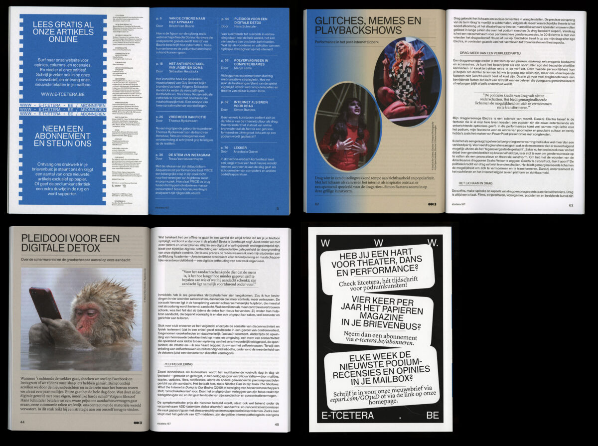
W: Yes, I do but I don’t make typefaces myself. Etcetera is possibly going to hate me for saying this, but whatever. One of the more fun aspects of working for Etcetera is doing the covers. It is really about finding the right image and right typographic tone, together with the editor of a specific issue. (The editorial team has several members and they switch responsibilities for every issue. So for each issue I’m working together with a different member of the team.) It’s always fun to talk about what could be a good image for the cover, what the main themes of the issue are, and then start the hunt for a typeface. Every time, you’re building up some sort of logotype, in some way. You are trying to grasp the theme of the issue with a typeface. For example, a big topic in theater, which is maybe similar to what D-E-A-L and Laurens were talking about, is that we travel too much, which is obviously not that good for the environment. This issue (shows the issue CONTRAPRODUCTIEF N°165) was dealing with that theme. The image is from a theater performance, of which I don’t remember the name.
Leroy: Isn’it Bartlebabe by Anna Franziska Jäger?
W: Yes that’s it. It shows someone holding a wheelcap, as a stirring wheel or a car. And the typeface is basically the same typeface that you see on flight tickets. So it’s some sort of visual pun. And then, this thinking process happens with every cover. You try to look for the visual pun. Sometimes the texts are a bit too heavy, at least to me, so you try to make it fun by making this really expressive cover. That is at least what I am interested in.
Leroy: So the typography used on the covers are all from existing typefaces? Do you sometimes adapt them?
W: I change them around. So I often depart from an existing typeface and then I adapt and tweak it, make it fatter or some other manipulation. You make small redactions, but that is about it.
Leroy: About the logo, is it something that already existed, or did you adapted it from a former logo?
W: When I took over, the basic logo of Etcetera was just three dots which made complete sense but it was also a bit bland, in a way. It felt a bit too obvious. So we sat down and started drawing stuff. I thought about Etcetera, with this new editorial board, trying to open up and broaden what theater could be and how you should write about theater. So we did the same with the logo. How can we open it up? The silly action is you just take one dot and you fold it open, into a square, so it becomes like empty space. It also resembles a stage a bit. The logo leaves an exit, so to speak. Then again, it is also just aesthetics and a visual play.
Leroy: It is quite central because also on every page inside the magazine the logo also is present, next to the page number.
W: Yes, at the bottom. I use footers a lot. I don’t why, I really like them. Page numbers also.
Question from the public: Is the typeface an issue with the team of Etcetera?
W: It depends a bit on who’s working on a specific issue with me. Sometimes it takes a bit more research to solve the cover. You really have to discuss together to get the right direction. In the beginning, it was somewhat difficult but lately Etcetera’s been more open to these type of experimentations. I send them several covers with different header tryouts and several colors. I don’t know why, because usually I am not that colourful myself, but these covers are always super colourful which is a bit weird actually. So that is why I was a bit confused when you told you wanted to talk about Etcetera. It is very playful in a way, which I am a bit less, I think.

Pia: Is it a reaction to the interior of the magazine? Here it is also a free magazine, does this also influence the designing of the covers?
W: Yes, it does. The fact that it’s free influences, for example, the choice of the paper or the design of the cover. So less money means less expensive paper. But also you have to make it stand out on these shelves where they put all the flyers. You have to make a mark there. This is also one of the reason I started to use a lot of colors, to make the magazine jump out.
Leroy: How does the magazine influences the other projects you are working on and your practice in general?
W: Not so much actually. I don’t know. It is part of a whole. You have certain graphic designers who have an identity as a graphic designer. So, as a client, you can come up to them and say ‘I want a piece of your pie, of what you are making’. But that is not how I like to approach projects. How I see it is that a client comes to me with a problem and I have to try to find to best graphical solution to that problem. In a way, it is not really about me. It is not about that, as a designer, I’m into this specific typeface so I am going to use this one only. That is not what it is about. You have to take a good look at the content you want to translate it to an identity, poster, website,… I think it is much more interesting to work with your client to find the best solution for them and for you. So it is not really about imposing my rules. It is about finding the best solution, be it graphical, be it a typeface or something else. I am not claiming to be style-less but I prefer to keep an open mind when somebody asks me to design something for them. Of course, context comes into play. For example, there is a cultural institution in Antwerp called ‘Het Bos’ where they do concerts, parties, workshops and other stuff so you are designing within that specific context, one of abundance.
I am also doing the graphic identity for a year now for Kunsthal Extra City at their new location, which is a former monastery. So you are designing within the context of a monastery. You are trying to find solutions on how art can fit in a former monastery and how it can react to that specific situation. So to answer your question, it does influences a way of thinking that is present there.

Leroy: One last question, how do you think the identity will evolve? Is it still exciting for you?
W: I am really glad you ask it. This morning, I was packing up the publications and I realized it was five years I am doing it, I thought it was only three! But the current design and format are three years old. The good news is that Etcetera got a bit more which means that we can maybe change this into a new thing. I know they will be listening, so I’m open to redesigning the magazine again into the next mutation. It could be a different format, new typeface or a complete haul-over, could be anything. A change might be nice.
Pia: Well, now the message is out there for the team of Etcetera!
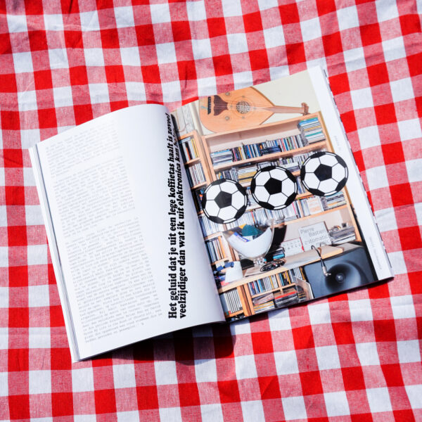
W: I have a question for myself which may be a bit weird but whatever, about how to deal with the images inside the magazine. Most theater places are run on low budget: they do rehearsals, play it a couple of times, and there is the general repetition where the photographer comes and takes pictures. These are the images which end up on the posters, the website, the advertisements, all the other stuff. It is difficult when you are making a magazine to deal with those pictures because you cannot cut them up so easily because they are the official pictures. Or they have been around, so everybody has already seen them. Not every maker is very open to those images getting changed so that is why some of the essays are just text with pictures that we have already seen a couple of times. I’m a bit generalizing here. So another fun part of Etcetera is also finding solutions to deal with images that have so many repercussions if you change them. If you change the colour, someone might get pissed or the photographer will get a bit annoyed. So you really have to find specific solutions for every text. The text is set in F Grotesk by Radim Pesko, so when you load it in it looks nice. But then loading in those pictures and finding solutions, that is the main task of Etcetera.
Pia: Thank you very much for your question to yourself! Thanks again for your time and for bringing the magazines to the seaside.