La Lune Menteuse
D-E-A-L studio and Laurens Otto about RESOLUTION magazine
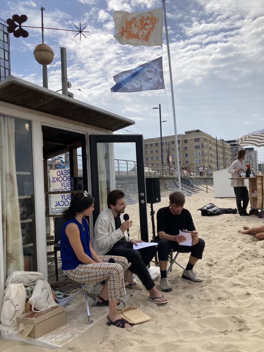
As the moon affects the tides, the Belgian Institute of Graphic Design settled at the cabin of PLEASURE ISLAND in collaboration with HARING BOOKS. During this event, we invited editors and graphic designers to uncover their perspectives on three independent magazines. Editor Laurens Otto and design studio D.E.A.L. told us more about their collaboration on RESOLUTION magazine.
Laurens Otto: Thank you Leroy Meyer and Pia Jacques for inviting us – it’s very nice to be at the beach. My name is Laurens Otto, I am the founder of RESOLUTION magazine. I also work as a curator at Museum Dhondt-Dhaenens. We will present the RESOLUTION magazine with Victor Coupaud et Morgane Le Ferec, both graphic designers. They are D-E-A-L, and based in Brussels.
I will say a bit more about RESOLUTION and especially about the latest issue ‘HOT PICTURES’. With D-E-A-L, I have been working together since four years. Besides RESOLUTION Magazine we have also collaborated to create the new graphic identity of Argos, in Brussels.
RESOLUTION is about a lot of things. Resolution means the level of detail of a digital image, but a resolution also means an agenda or a clear goal. The magazine has resolutions. When I set up the magazine, it was in response to two things. First, I noticed that a lot of discussions within the artworld are simply staying there – are reverberated in an echo chamber. I was interested in creating a space where discussions could become broader and could involve other people, outside the artworld. In the case of the digital image, this means people working in the different industries producing such images. The magazine is not about what an image means, but how it is produced. I wanted to have a magazine which has another engagement with artists. Artists are not simply involved to could portray this or that issue, but are rather involved in technical discussions and are part of the editorial process. On a more profane level, they are also invited to makes editions.

The second position of the magazine is that it is a contrast to certain magazines that are interested in contemporary art in general. Why not set up a magazine that has a strong and clear question and that repeats this question over and over again? This question is: “what do digital images do besides representing things.” I am not interested in what an image depicts, but how their circulation formats our world. I will give an example: When I noticed that when AIRbnb started growing so rapidly, it did so because it started to engage professional photographers and gave them clear guidelines on how an apartment should be photographed: white walls, some quasi old furniture, a few personal details (but not too many) and of course the wide angle lens that make the apartment look bigger. What it is interesting, is that these guidelines became the exact interior was taken up by many people, restaurants, IKEA etc… It is a clear case where a certain guideline for an image becomes a reality, in this case called ‘airspace’. An image is thus not only a representation of the world, it can also format it.
I will say two words about our latest issue, which was made with guests editors Kyveli Mavrokordopoulou and Giacomo Mercuriali. If we have one overarching question, “what do digital images do besides representing things”, the question of this issue was: “how do digital images on the one hand represent climate change, and on the other hand, also contribute to it, by heating up the planet.” It is called “Hot Pictures” because images generate heat when they are produced. One of the guest editors wanted to call the issue ‘pictorial thermodynamics’ which means the same thing as ‘Hot Pictures’ but is just a bit less sexy.
You could say that ever since Plato’s cave, you need a certain amount of energy to produce images. In that case fire was needed to create shadows, and today with digital images, the energy demand is much bigger. We should ask what their planetary impact is. I can give one last example of this broad relationship between digital images and climate change as a question to the crowd: “what is impressionism to you?” When you think of Monet, or Turner, what do you think it was? What do you think they tried to do? (…) When you think of the great impressionists, you might think of these beautiful paintings representing novel clouds. As one author in this magazine explains, what impressionism did, was to mystify mist. It mistook the clouds of the industrial revolution as some sort of aesthetic novelty. In that line, we can ask today when we see meticulous images of forest fires or toxic clouds, are we missing the climate disaster looming behind these images? That is one of the main questions of this issue. Let’s go more into detail with Victor and Morgane, about the many decisions that led to the graphic design of this issue.
Victor Coupaud: Thank you for this introduction. With Morgane, as D-E-A-L studio, we were asked to work on the visual identity of the whole series of the magazine RESOLUTION. Thank you also for letting us speak in English because our level in Flemish doesn’t allow to speak fluently yet but we are working on it. Maybe, we can dive in the overall graphic identity. We will try to not make it to laconic in order to make a bit more sexy like Laurens mentioned. Laurens came to us with an idea of making a magazine but the task was a little bit new for us, because it is in between a magazine and a revue. We had to find a specific format for that. This is why RESOLUTION is not like that big but also not too small either – it’s the compromise we have made. An important thing was the economical side of the magazine. This of course shapes a lot the magazine itself: we decided for few colors, black and white for sure and then one pantone PMS with it, changing every time according to the cover.
Morgane Le Ferec: The paper is a regular offset paper. There is just one color section in the magazine (a visual essay by Femke Herregraven). We decided to design according to the budget we had.

Victor: We made the basic recipe for the whole issue. For now, there are only two issues but this is changing a bit with the upcoming one. We have also made the choice to only have two typefaces into it one that is a bit more monospace regarding to be clearly linked to the digital aspect of the magazine and the other one is a refresh of the Times New Roman, called ‘Happy Times’ that was designed by Lucas Lebihan for the IKOB museum here in Belgium.
Morgane: We have chosen that one because the Times is the default typeface that you can find on the web when you don’t use a stylesheet.
A bit like in a classical magazine, we have different styles for every article: Interviews are designed in a certain way, essays in other way, etc. We have different lay-outs according to the content. But we decided to keep the same typeface everywhere and also the same body of text. We tried to keep two bodies of text in the whole magazine to stay consistent.
Laurens: Sorry to interrupt, but the elephant in the room is the question ‘why would you make a paper magazine about a digital image?’. For me, it was very important to make a magazine that doesn’t show off too much many different colors or the many great images it could present. I very much like the solution we came up with the edition number 0, our pilot-issue, that there will never be an image on the cover. From thereon, we can easily change the color depending on the topic of the magazine. This edition has the polluted color of a bronze ochre brown. This question links to a very important aspect of the magazine, that it somehow always has to justify why it exists.
Morgane: We also picked a very glossy and shiny paper for the cover to evoke the digital devices, like smartphone shells and things like that. It was the idea to have that kind of glossy effect.
Victor: By having no images on the cover, it was matching the idea of Laurens who wanted something radical. Also, Laurens came to us with only one reference, super sharp, for the design.
Morgane: Yes, the Situationiste journal! It is really a tribute to those covers.
Victor: The Revue Situationiste was distributed in Paris, in the 50’s and 60’s. On the cover, there was only a metallic color with the title. We quite liked this radical design gesture, so we decided to keep it.
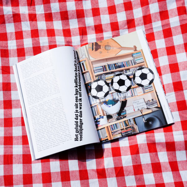
Morgane: Maybe we can go a bit more into detail about this first issue. As you mentioned, the color of the cover is evoking toxicity and pollution. It is also a direct reference to the artwork of one of the artists that it is the magazine called Matthew C. Wilson. These are excerpts of the movie that is discussed in the magazine. The whole movie is actually in these sepia/orange tones. Our main choice for this magazine is to use an algorithm created by Øyvind Kolås.

Victor: For this issue, we went more radically for the treatment of the images. We used the assimilation color grid. It is a plug-in, which fakes the color in the black and white image just by making a color-raster into the image. Basically it is a black and white image in the background and the grid onto it. In this version, we use only the one pantone color. For us, it was an attempt to see how far we can go with the magazine and experiment with it. It was also to try to save some ink and money for the magazine. It didn’t really work out in the end, but it was an attempt and a proposal more than a real strategy.
Morgane: Yes, it wasn’t economical at all actually. Just in more technical terms, it was to use less ink by using a grid in place of a full-color surface. We can also say that it was a big challenge for the printer. (Drifosett, based in Brussels) It was the first time they were printing that kind of pictures. The difficulty came from the overlapping of the two rasters, which made it hard to be sure that the images would be legible at the end. Luckily, it worked!
Victor: It was the main thing we learned with this issue. The discussion with the printer was super interesting for us, and for the next issue.
Morgane: Maybe a new challenge for the next issue!
Victor: It is something we want to develop for the next issue or another project.
Laurens: Maybe you want to say how this connects to your work in general? How does it relate to your day-to-day practice? Also, you are normally a studio of three people and not just you two.
Morgane: I guess we can say that the way we use typography is a good illustration of our practice. We mainly use typefaces to create visual identities. We think that typefaces are very narrative, like shapes are narrative. So, you can use the shape of the letter to create stories.
Victor: We can quickly give a bit of background. We are not coming from graphic design directly, because we started by illustration so we have this narrative view on graphic design. We all first start by making drawings than by designing, so this narrative thing in the characters of the alphabet, is still kind the most interesting for us, still now. We are for the moment mainly busy with typefaces. Also because, the third one of the trio, who could not be here today, Quentin, is developing websites. We have this digital aspect which is important in our studio.
Laurens: Could you say something about your next steps in creating typefaces, what you are developing now?
Morgane: Yes, we are busy building up a foundry for the moment.
Laurens: What is a foundry?
Morgane: A type foundry is the digital space where you can find typefaces.
Victor: Well, it is now a digital space! It was before the company that was selling typefaces. But it is only digitally, so it is a website. It is a bit less romantic than a letter print space but it comes out a bit like the same thing: to design a typeface, putting it on the market. We are setting up the platform so it is not really alive yet but it will be soon. We are working a lot with old Belgian typefaces which were not digitalized yet. Next to this, we are working with designers from abroad or making our own custom typefaces. We are also re-designing some custom typefaces we have made for projects, finishing them and making them more clean so that they are ‘ready-to-use’.

Morgane: After this short advertisement, if you have questions or remarks, don’t hesitate.
Question: Will the typeface released by the foundry be open-source?
Morgane: We are still thinking about it, but we probably have two different parts on the website, one with the open-source typefaces which are unfinished and then another part with the typefaces that you can purchase.
Victor: Our third member Quentin Jumelin is working a lot with open-source software, working with Linux. In the studio, we work with different tools. It is a specificity of our studio too, we are working with different programs to experiment with them.
Morgane: For example, the algorithm we used for the images in this issue is only available on gimp. All the images had to be treated through this program. Gimp is a more or less the same as Photoshop but is an open-source software. Actually, all the adobe software have their open source equivalents, it just you never learn them at school.
Victor: Adobe is buying some of the projects which were developed open-source to lock them. A lot of implementations of photoshop or illustrator came from open-source projects. This is why it is sometimes nice to reach to other resources.
Pia: I think we will end up here. Thank you for the talk and for coming to Oostende!